
Role
UX Researcher & UI Developer
Team
Backend Developer, Sales & Marketing Director, Marketing Coordinator, Founder/Owner, and the third-party SEO company.
Timeline
3-month+ (Cut short due to COVID-19)
Project Type
Professional Work & B2B (Web)
Website restructuring and redesign.
I created mockup designs for a corporate website redesign to transform the company's image by evaluating its brand, conducting user research, and comparing the results against market competitors. This was done to receive a surge in software purchases and reduce customer service inquiry calls regarding training.
The desired result is for a decrease in the volume of calls made to the tech support regarding basic questions on using the software. New users of the software need a to easily find the answers to their questions about the software.
UX Researcher & UI Developer
Backend Developer, Sales & Marketing Director, Marketing Coordinator, Founder/Owner, and the third-party SEO company.
3-month+ (Cut short due to COVID-19)
Professional Work & B2B (Web)
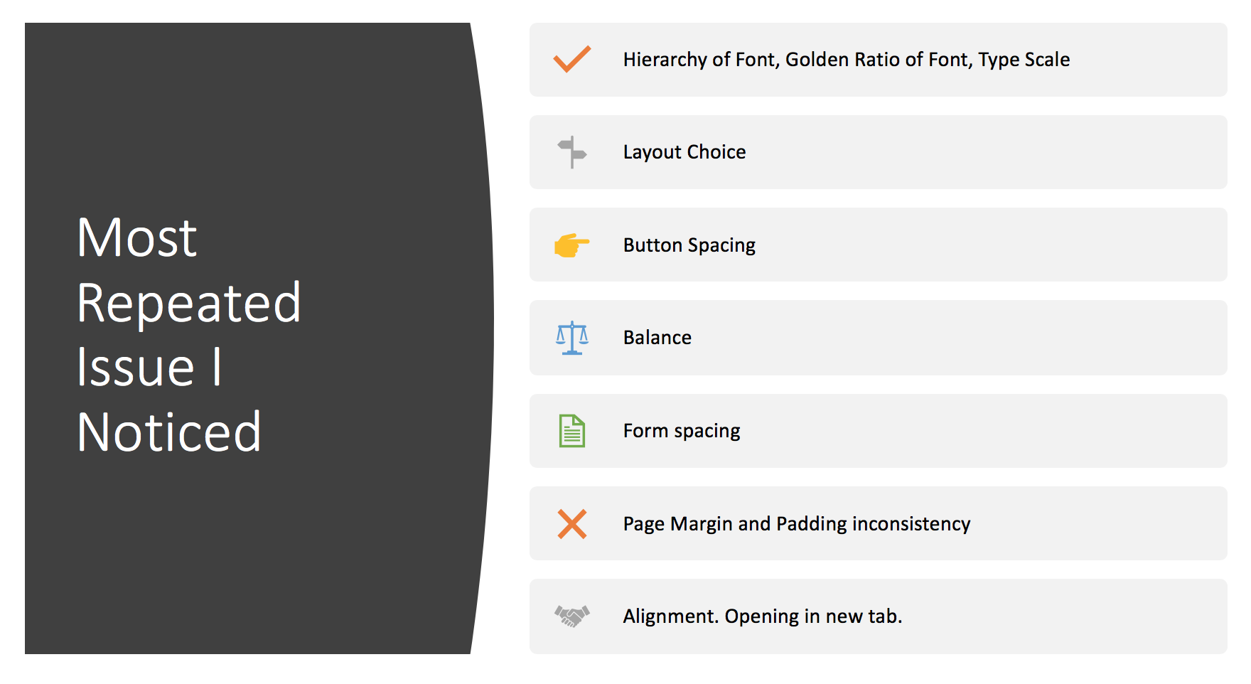
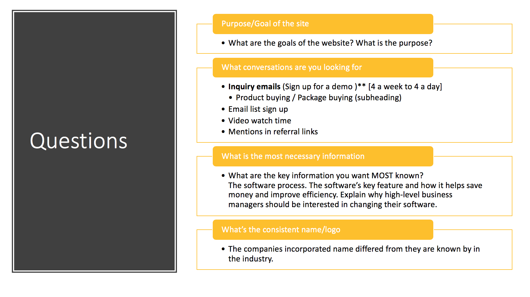
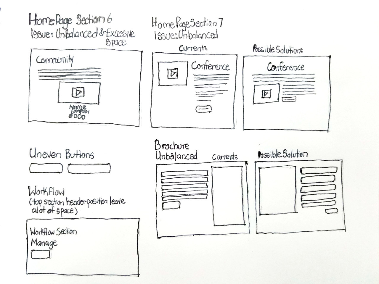
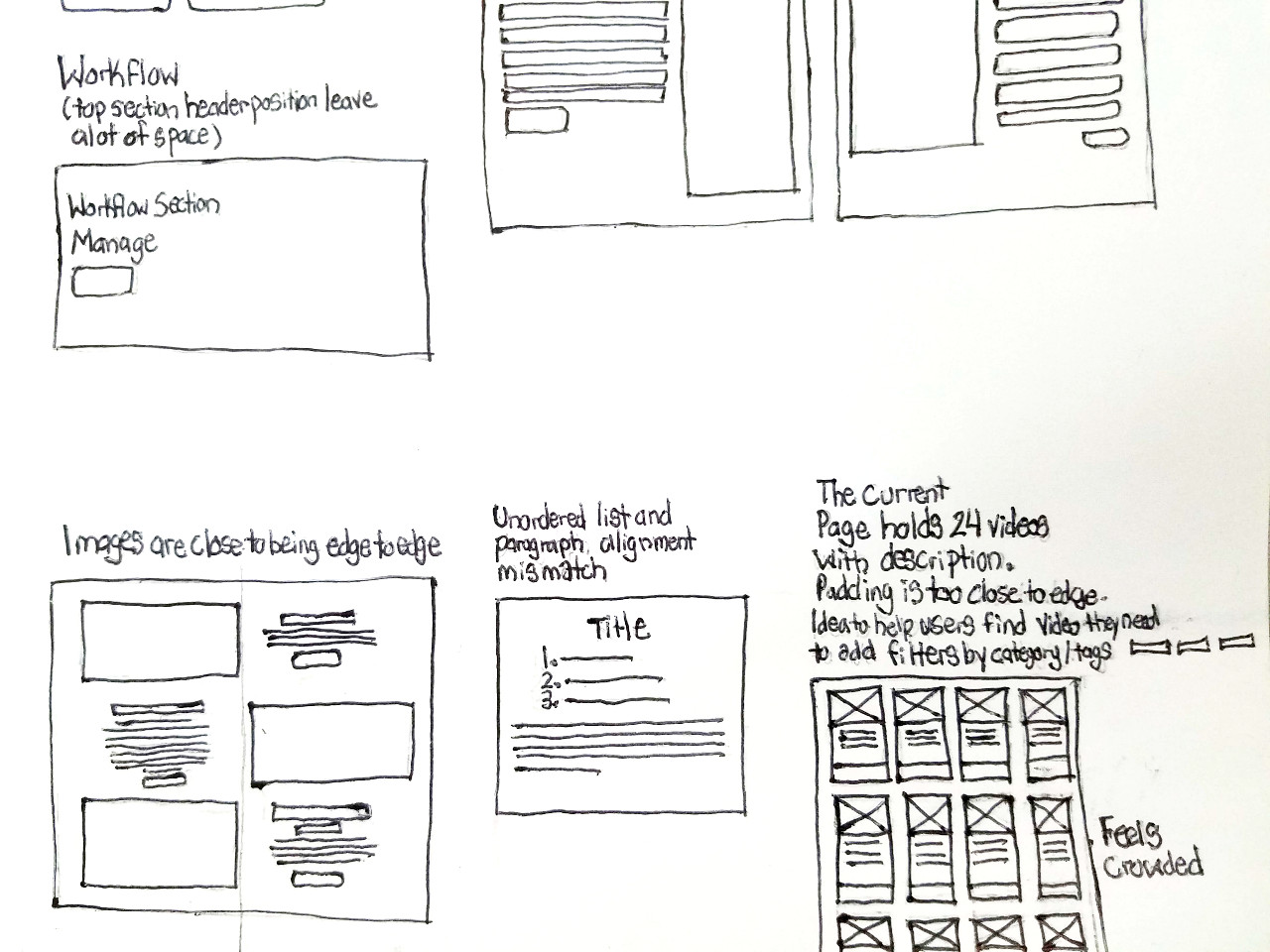
I decided on my own to do an audit of the website's content, design, layout, and experience from a user experience designer point of view. Though I was told superficially what were seen as the problems on the site I needed to fix, I wanted to understand the entirety of the website, sub-domains, and affiliate websites. From what I gathered, I create a list of the most common issues.
“[As UX designers we] understand how to methodically and meticulously plan a UX campaign. And that's what getting a job actually is, maybe we just don't realize it at first. So, we need to UX ourselves, we need to UX our resume, our [port]folio, our process, our interviews, everything.”
- Andrew Doherty former Google UX Designer


The website has so much text it is an overload of information. Thankfully the information on the website is correct though the messaging is described as "off". The success of conversation stats depends on which team member is asked. Metrics in question include newsletter subscription, calls received by the sales team, downloads of trial versions of the software, and other conversion statistics. The website should encourage visitors to call the company. A sales team member stated there's an increase in sales rate when potential clientele talk with a person. There's also a need for more sign-ups for demonstrations.
There is a drastic difference between the founder's belief regarding the website's purpose and the marketing team. The key company value most iterated by the employees was "community". There seems to be a unison desire for the company to be seen as a pinnacle member of the road servicing community. A resource to turn to for valuable information and open discussion. Some users when faced with difficulties using the software blame the tool to spare their ego, in contrast, to calling tech support, watching the online tutorial, or attending a supplementary class.
The company's image is VERY American, which has hindered its expansion into the international market. The company needs to have more of a global feel to appeal to international clients. Ideas to appear more international include using diverse photos. The current site only displays American roads that are larger than most European roads. The website should also use more neutral language downplaying the American accent.
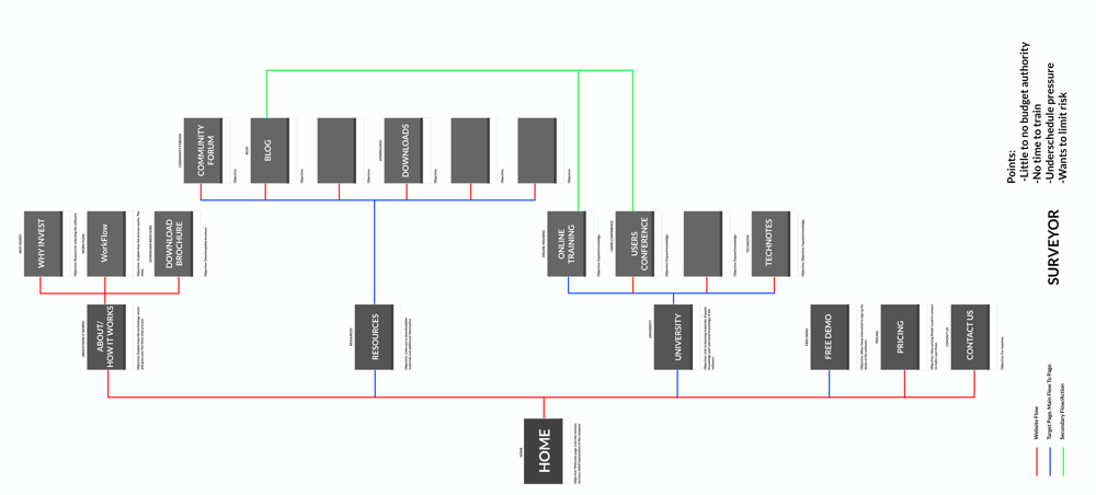
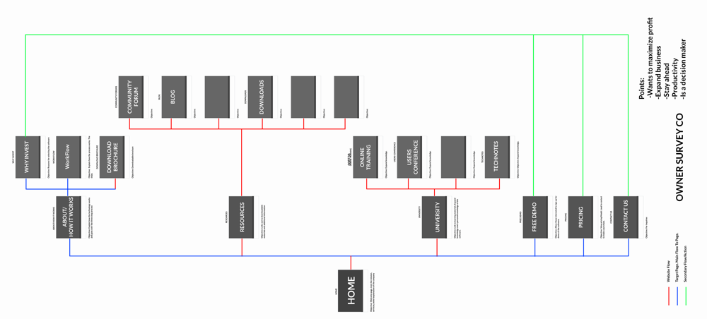
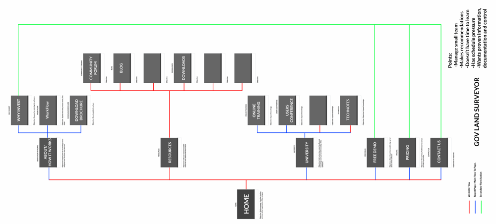
Personas related to those in the servicing industry and range from those directly using the software to the decision maker for a company in the purchase. Personas included:
Concerns/Needs:

Concerns/Needs:

Concerns/Needs:
Informed • Secure • Confident • Satisfied • Confidence • Authenticity
Industry competitors varied with small scaled companies, international competitors, market share, those who utilized the clients software. Without giving away vital information, below are short sentences describing a characteristic of a competitor.
Technology - Design: Sketch App, sketch paper
Technology - Development: The website was built with Twig, template engine for the PHP programming language, Less, backwards-compatible language extension for CSS, PHPStorm, Foundation, and git.
Constraints: The constraints I felt during this project were being onboarding during the beginning of the coronavirus epidemic. I had to transition from in-person to remote in a matter of days. To connect with my co-workers, in the absence of the bonding we would've had in-person, I scheduled video calls to ask questions and get to know their job roles as well as themselves on a personal level.
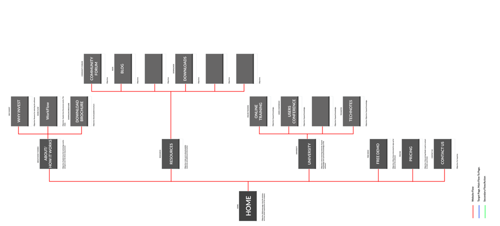
Home Page - Option 1

Home Page - Option 2

Home Page - Option 3

Home Page - Option 4

About Page

Additional Page

Software Download

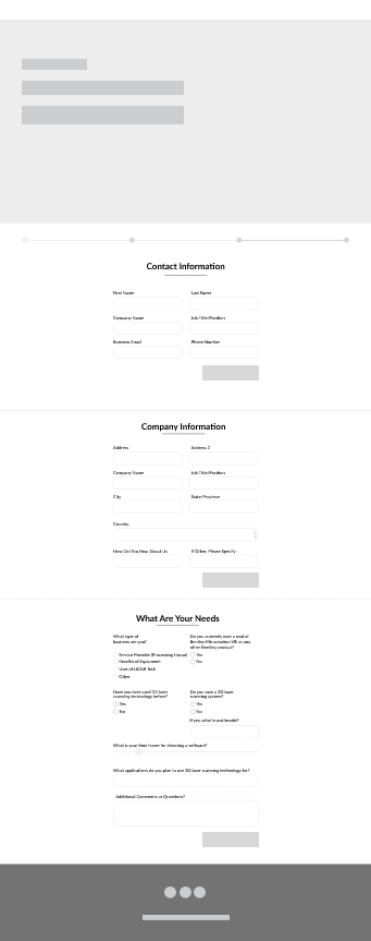
Demo Sign Up
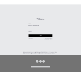
Dashboard Sign In
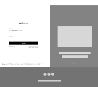
Dashboard Sign In
Each design for the home page reflected content importance from the view of the different teams (marketing, sales, customer service), personas, and clientele feedback. Having different layout versions was to avoid dismissing a point of view nor have ideations based solely on the owner's perspective. One design version influence came from the marketing team's research on clientele behavior, another based on the sales team's perspective, one design comes from a mix of the sales, customer service, and marketing team's key points, and one honor's the owner's desires.
The idea was to test each option, and through data, determine which home page design was the most impactful in garnering the desired outcome. The results measured were to be improved bounce rate, secondary click through, longer average time on page/session duration, and increased interactions per visit (pages/sessions). The drop off rate and exit page for traffic coming from countries outside of the United States would also be monitored. Keeping in mind the company's ideals to expand into the international market and prior failures to come across as global to appeal to international clients. With the international market in mind, a quick solution would be delivering varying images of roads based on IP address, North America vs. Europe. If not capable of being executed, option three would be appeasement with multiple pictures of both North American and European roads.
Design changes to help the company save money: While interviewing employee personals who work in customer service and receive inquiry call, I learned the volume of calls they received regarding training materials on the website was a higher number than previously thought by the engineering team, marketing team, and company owner. These calls prove to be the hidden costs the company was unknowingly burdening. The perceived cycle in which the engineering team developed the software and the sales team succeed in creating software purchases. The marketing team marketed the software, and the customer service team handled customer calls. There was a bottleneck that was hindering the other phases in the cycle.
The marketing team was spending more to improve the software's perceived image, else it'll become hard to persuade low to mid-level managers or survey company owners to buy the software. Spending advertisement budget to undoing negative perception and PR is cost taken away from other marketing opportunities. Thus the marketing cost increased. Meanwhile, the customer service team receives large volumes of calls from flustered users.
So let's put this into numbers:
Compare this costly ordeal to instead accessing a knowledge resource on the website. A website that is essential accessible at any time. If not for being axed by the coronavirus epidemic, this was shaping up to become an impactful project for both the company and its clients.