LUXITA

High-end luxury nail salon.

back to top

Problem Statement: Building For
Two Cultures

J-Cast JoliArts were opening their fourth nail salon in Tokyo and first in the Shangri-La Tokyo Hotel. For this reason, I was brought in from America to Japan to brand the LUXITA online presence and launch a multi-lingual website in time for the launch.

International tourists with no to limited Japanese language skills aiming to visit the nail salon need a quick, convenient solution for booking appointments, and locating the salon. Luxury brand enthusiasts seeking an experience, need easy to see nail options. Both Western and Eastern users should be able to navigate the website easily.

View Website
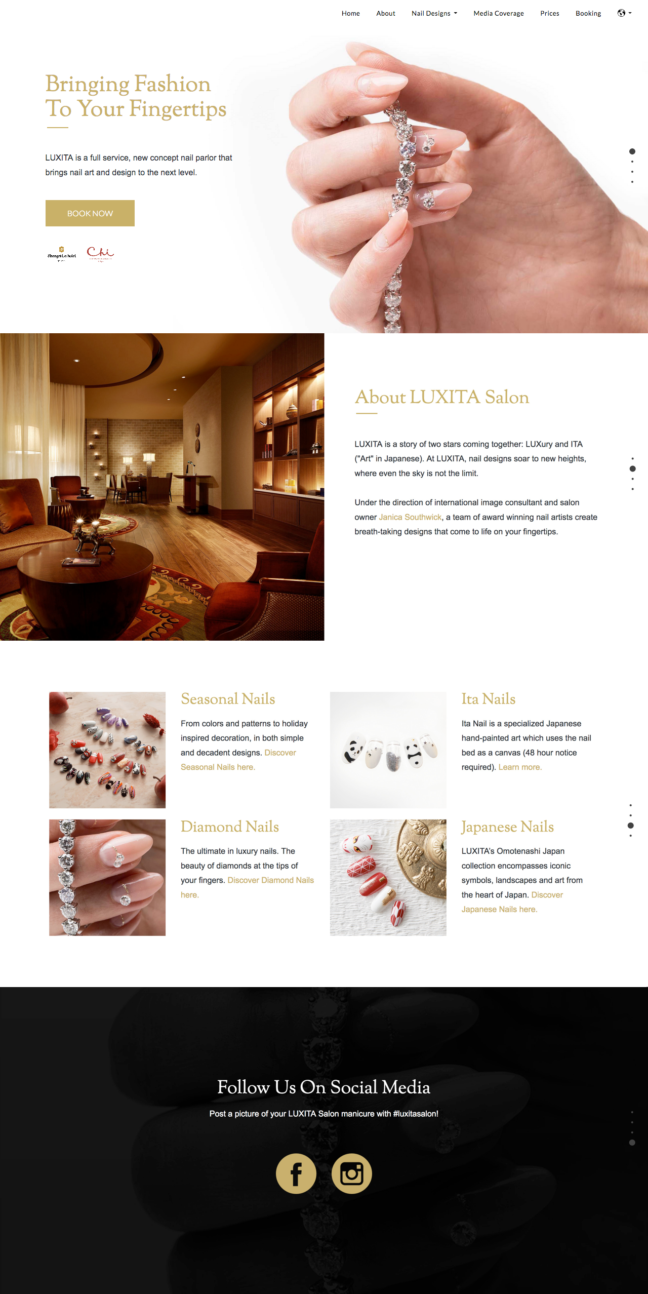
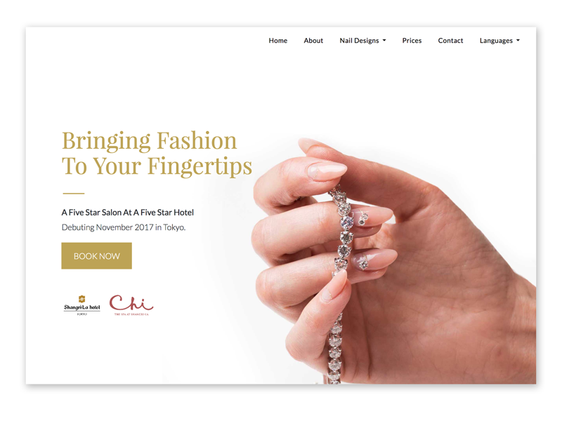
Branded design of luxury nail salon. UI design by Katherine Delorme.
The home page of the English website. Credit: Katherine Delorme
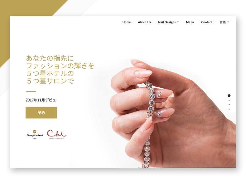
Branded design of luxury nail salon. By Katherine Delorme.
The English website being converted to Japanese. Credit: Katherine Delorme
Role

Web Designer & Developer

Team

Company Owner, Manager, Japanese Copywriter, 3rd Party Stakeholder, and Graphic Designer (for consultation).

Timeline

7-weeks+

Project Type

Professional Work & B2C (Mobile, Web)

Project Goal

The goal of the project was to create a luxury brand website appealing to both foreign tourists and Japanese natives. While designing, we needed to avoid creating a cluttered site that is commonly seen on Japanese websites.

Challenges

  • The bulk of the project needed to be completed in 6-weeks during my stay in Japan.
  • The branding and style guide would need to be created.
  • The text-heavy business plan and presentations will need to be transformed it into user-friendly website content.
  • An unexpected obstacle occurred. The professional photoshoot for the nail designs took place on my last day in Japan.

— Research

“There is so much visual noise, that you can feel like you’re walking through the chaos of Shibuya streets in Tokyo.” -The challenge of designing UX and UI in Japan

Color

"In westerner cultures, red is the color of love and excitement and can be associated with both negative and positive purposes. But in Japan it means happiness and joy."

Typography

"There are only a few available web fonts...Japanese fonts need to include the katakana and hiragana alphabets and a pile of kanji...making their web fonts just too heavy to load on a webpage."
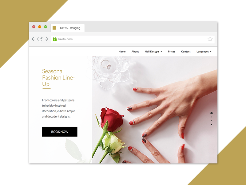
Browser window with the site. Book Now button and hands with red nails next to roses.
The seasonal nail color best highlight Japan's joyful association with the color red.
Credit: Katherine Delorme
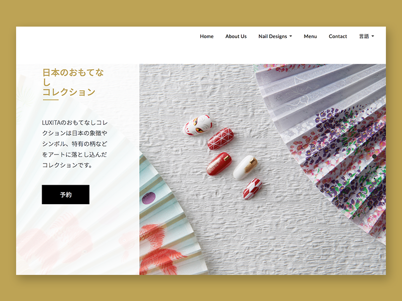
Branded design. Webpage with fans beside nails with Japanese text. Portfolio by Katherine Delorme
The Omotenashi Japan Collection encompasses iconic symbols, landscapes, and art from the heart of Japan.
Credit: Katherine Delorme
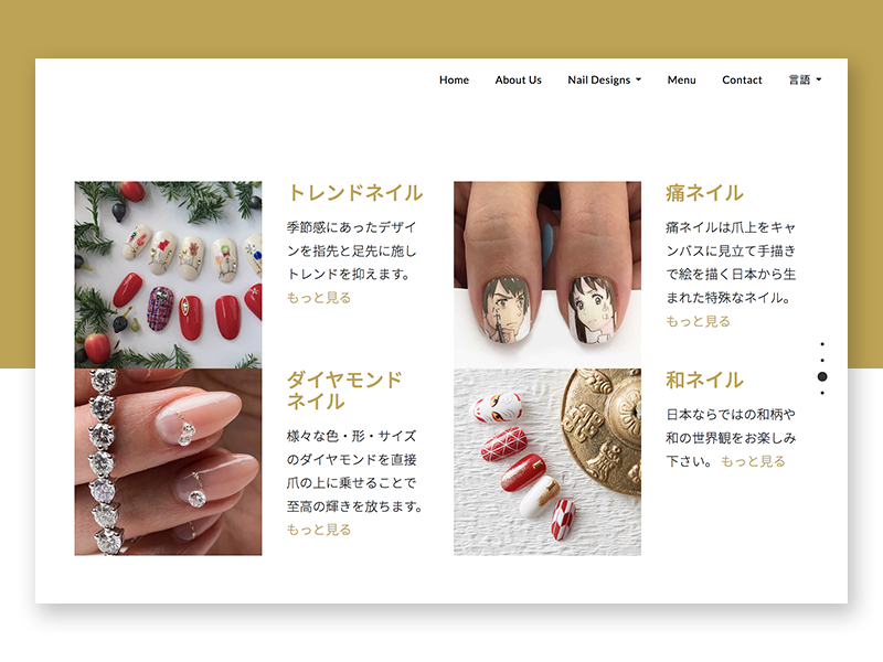
Webpage with four design options and Japanese text. Branded design for Katherine Delorme's portfolio
Four highlighted nail designs on the home page: seasonal, ita, diamond, and Japanese. Credit: Katherine Delorme

Research - Culture

Cash-based Society

Japan is a cash-based society. Though most tourist traveling to Japan are made aware of this fact, not every person living outside of Japan are aware. Those living in countries like the United States are accustomed to card payments and money transfer apps like Apple Pay, Google Pay, Samsung Pay, Square, and more.

Transportation & Mobile Culture

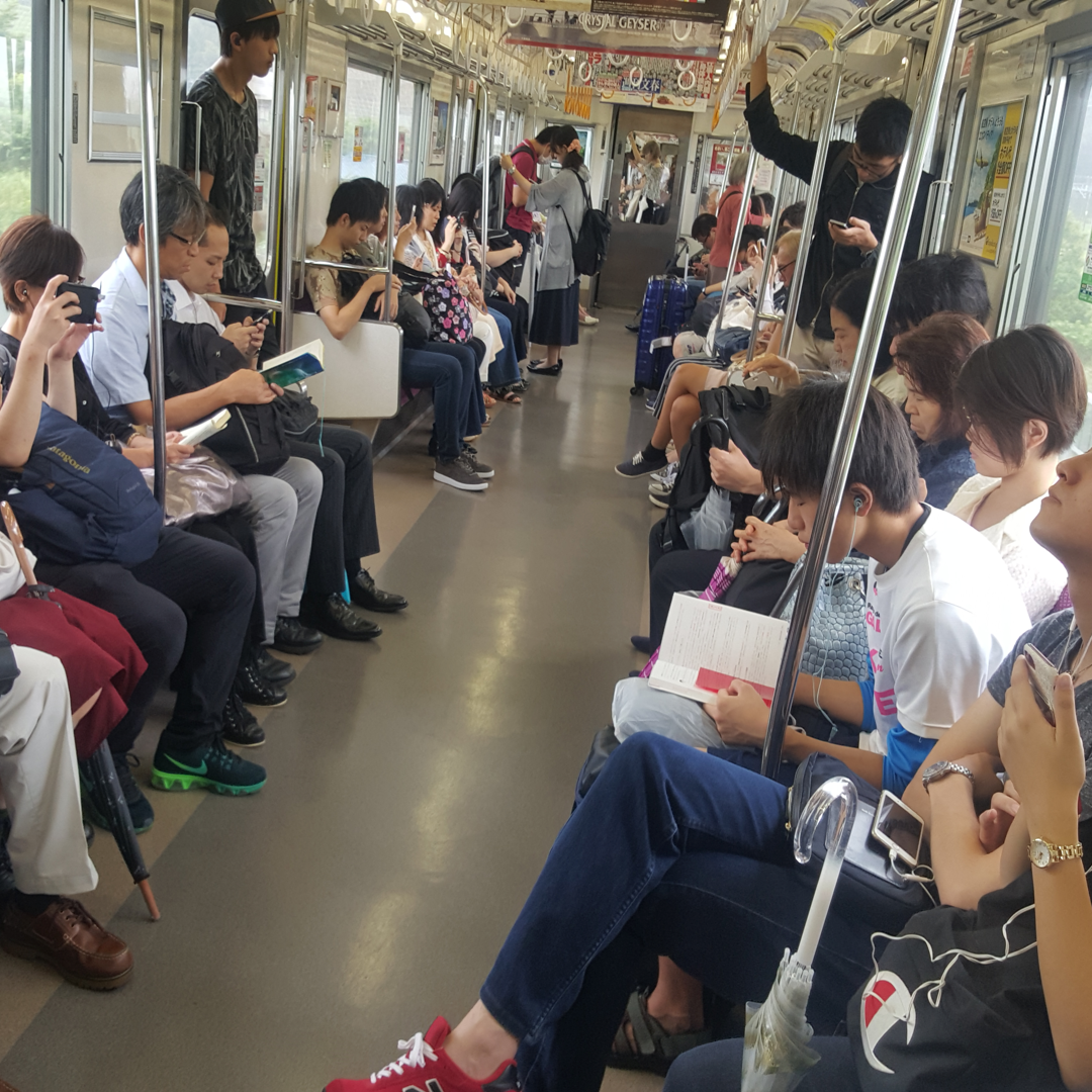
Japanese cell phone culture is tied closely with the transportation culture. The majority of Japan's commute takes place on trains. The idle time commuting on trains creates an increase in the usage of mobile devices.

Research - Personal Discoveries

“How do I pause my Western perspective of the world & open up to see an Eastern point of view?” -Katherine Delorme, that's me

Ask Questions - Listen - Be Open Minded - Experience the Culture

Changing my perspective and world view of "normal" allowed me to experiment with ideas, user experience, and interface design the same way I experimented with understanding another culture. I can not express how much this project not only changed me as a designer but also as a person.
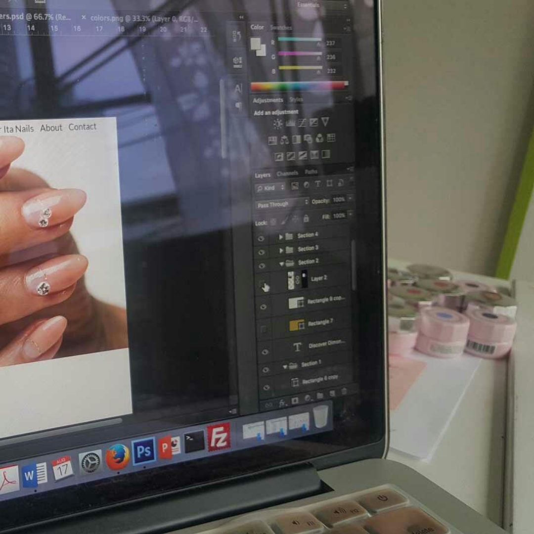
Working on a website design by Katherine Delorme
I visited and worked in the owner's previous nail salons. Doing so allowed me to talk with salonists and clients. Credit: Katherine Delorme
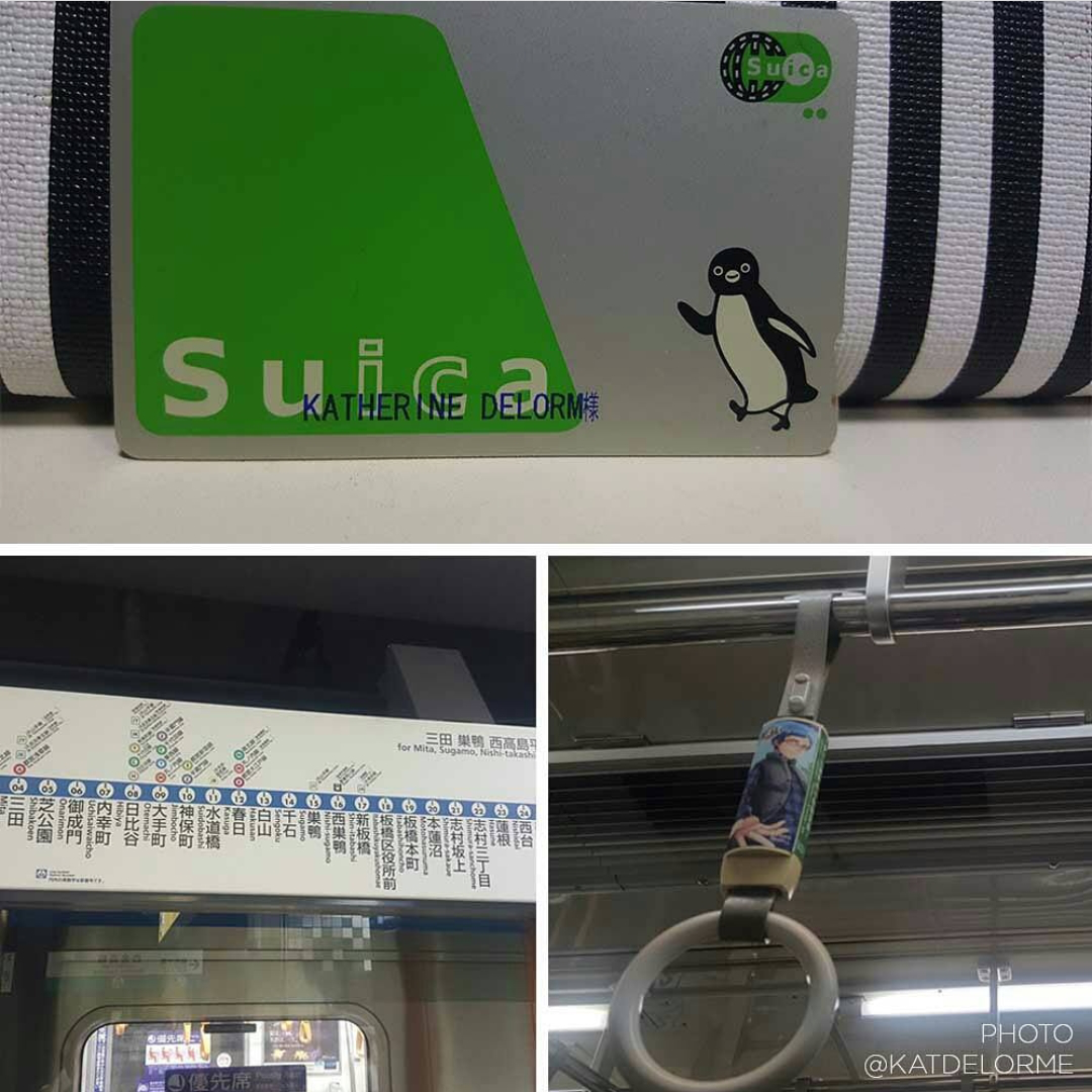
Riding on the train in Japan
While riding the trains, I soon learned first hand the rules that surrounded train etiquette, such as not talking. Credit: Katherine Delorme
Observing train culture and how people spend the down time on their phones, reading etc.
While riding the trains, I observed train culture and how people spend downtime on their phones, reading, etc. Credit: Katherine Delorme
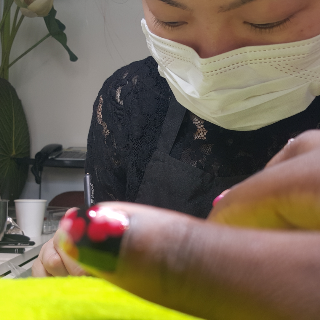
Getting nails done in a Japanese salon
I interacted with the salonist who offered me a nail service as an experience. While in her natural environment, she opened up more. Credit: Katherine Delorme
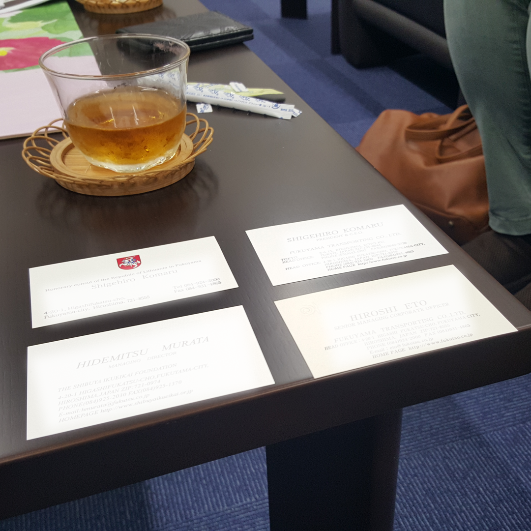
Japanese business card culture
Experiencing Japanese business card culture during meetings. Learning to place cards on the table in the right order. And accepting tea when offered. Credit: Katherine Delorme
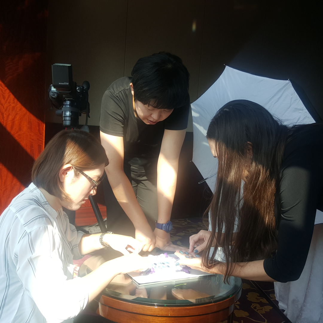
working on the photoshoot
I was able to help out during the photoshoot. I captured this picture when the team was focusing on setting up the nails.
Credit: Katherine Delorme

— Define

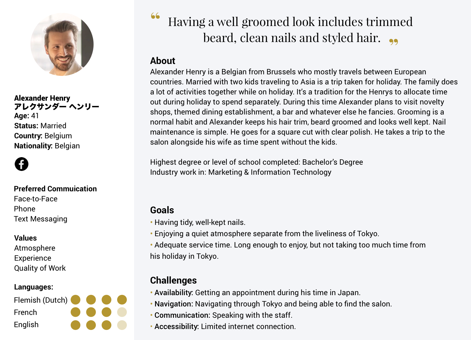
Define: Personas

I created personas based on the owner's previous salon's clientele for comparison. As well as personas for what would be the new salon's prospect clientele. Additional data given about the hotel's typical guests and usual foot traffic was also used. The addition of the hotel's insight widened my perspective from two personas to three: Japanese resident, an American tourist, and a European tourist. The additional details regarding the persona's lifestyle and habits came about from research findings.
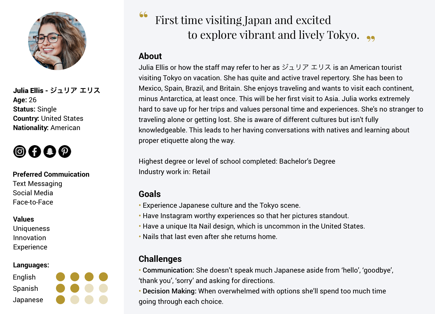
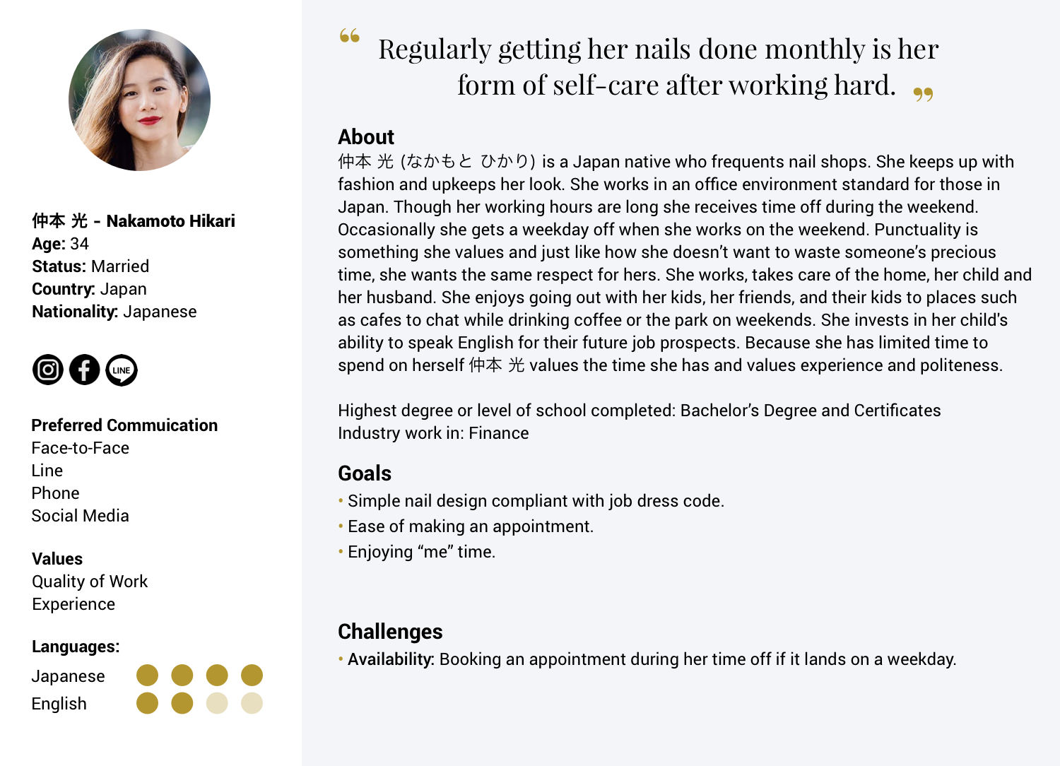
Fulfilling a Need (Persona Driven Result):
-A Men's Success Nail service was created aimed at business professionals and those in favor of a groomed attire.
-The site needs to have clear directions on how to find the salon. Google Maps can take a person to the building but Tokyo is famous for being a maze.
-Hiring a staff member at the salon who can speak a reasonable amount of English.

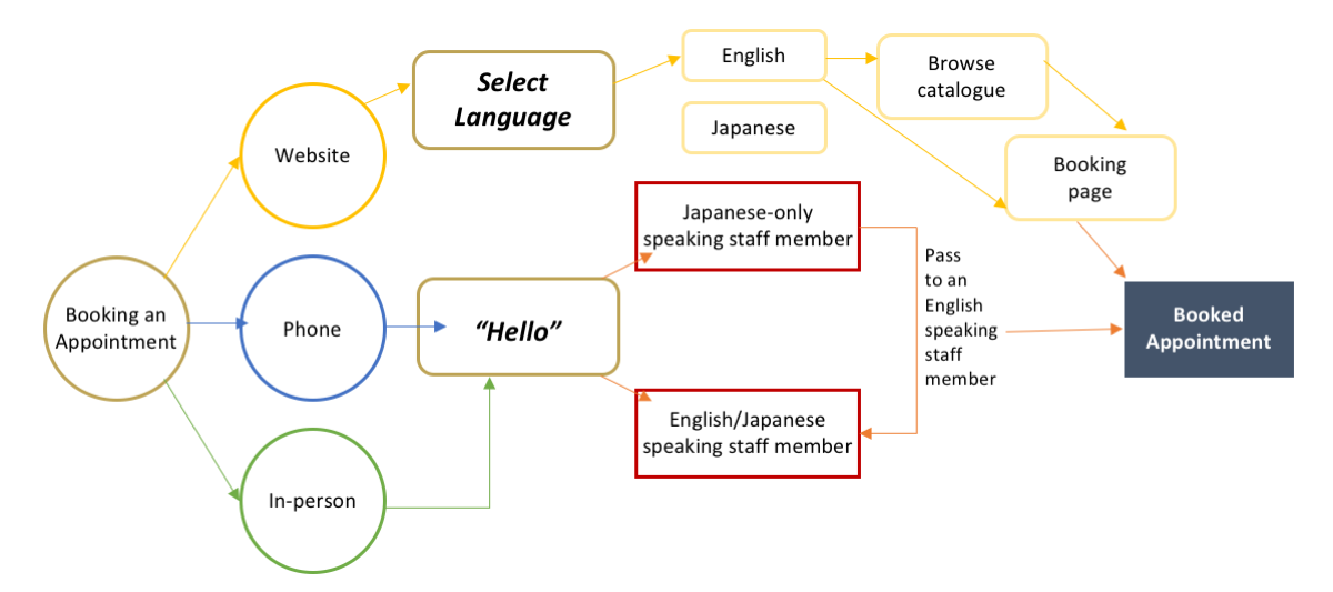
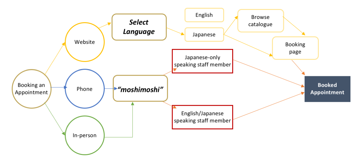
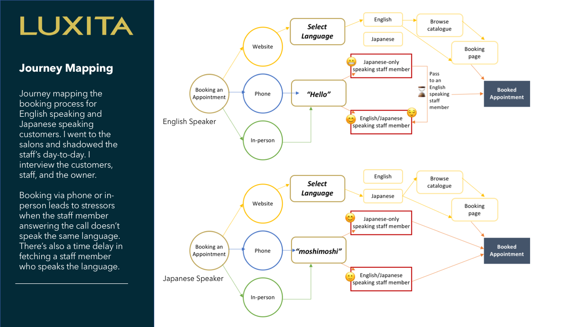
Booking an appointment - Journey Mapping

Journey mapping with pain points indicating with emojis.

Sketches

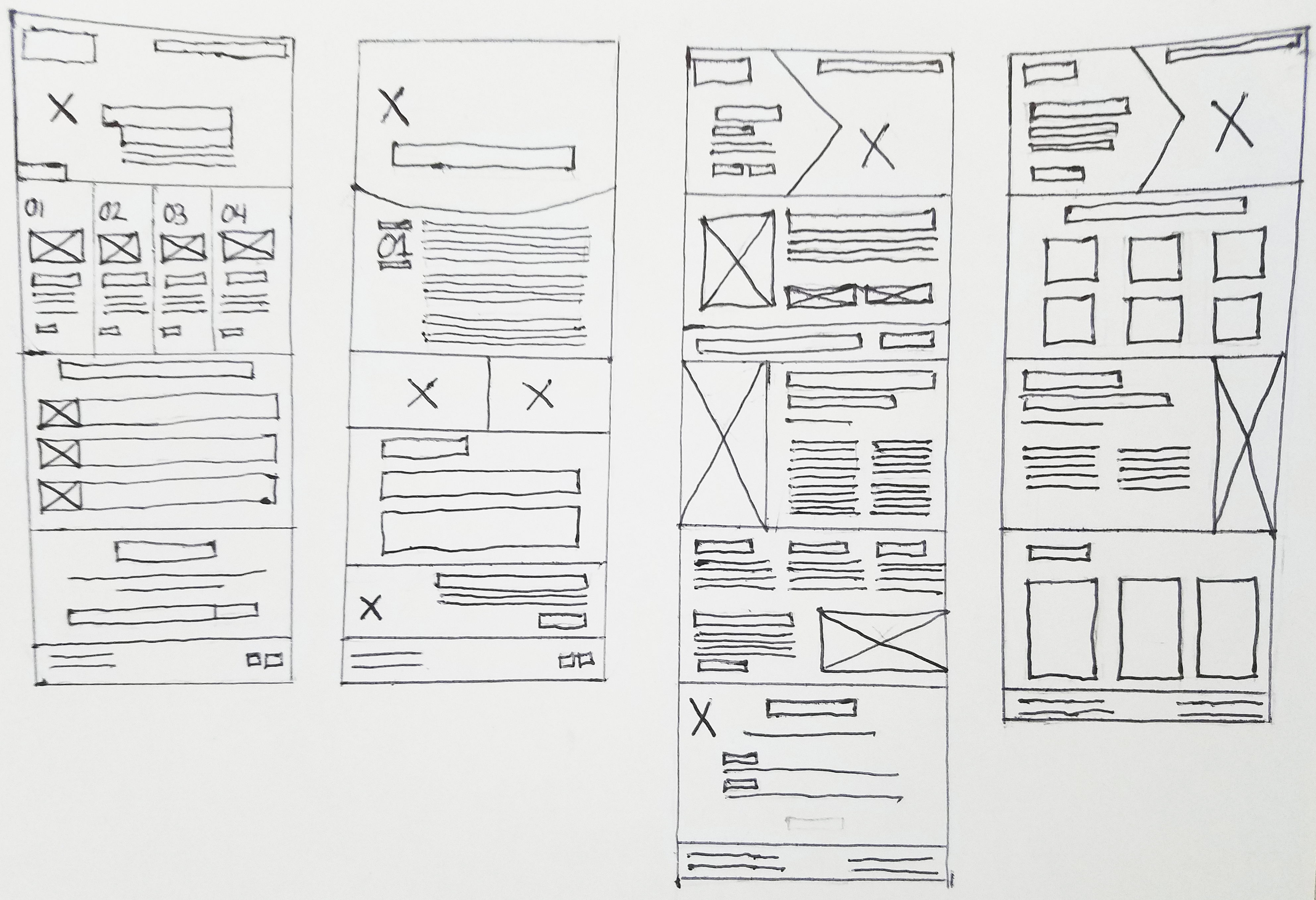
sketches for website
Sketches and ideas for webpages. Four iterations of the homepage.
Credit: Katherine Delorme

During meetings and sessions, when ideas were being bounced around, I would start sketching. A couple of the sketches made their way to production. Others still helped as inspiration.

— Outcomes & Lessons

Responsive mobile version is needed

The personas created helped prove the necessity for the website to be accessible on mobile devices as well as load quickly. International tourists are more likely to discover the salon on their mobile devices. Discovery, in addition to using the website's directions to navigate to the salon while in transit, made page load speed a priority. Japanese cell phone culture is tied closely with the transportation culture. The majority of Japan's commute takes place on trains. The idle time commuting on trains creates an increase in the usage of mobile devices.
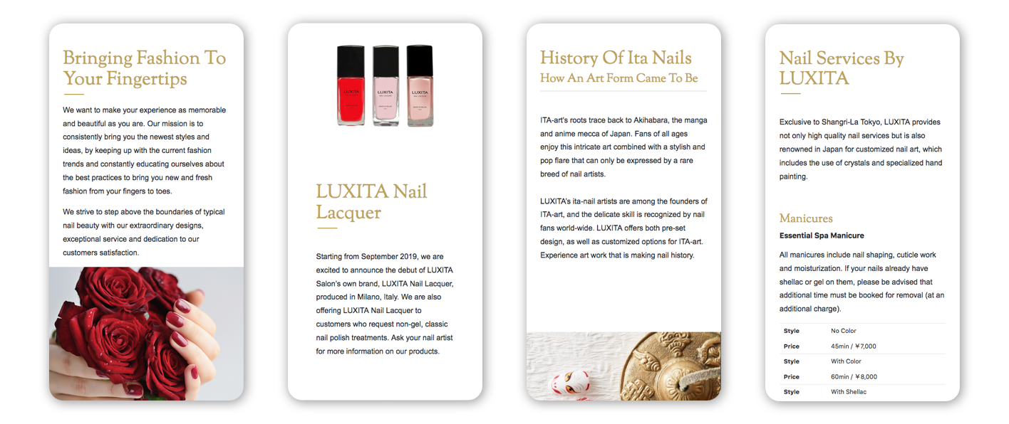
Mobile version design by Katherine Delorme.
Mobile responsive view of the website. Credit: Katherine Delorme

Offering language options

A demonstration of selecting between languages on the navigation bar. This is the first iteration.
In the second iteration, a globe icon was included to indict language selection. Credit: Katherine Delorme

Discovery from Research - Creation of the “Men's Success Nail” line

Fulfilling a need and tapping into an underserved market. A Men's Success Nail service was created aimed at business professionals and those in favor of a groomed attire.
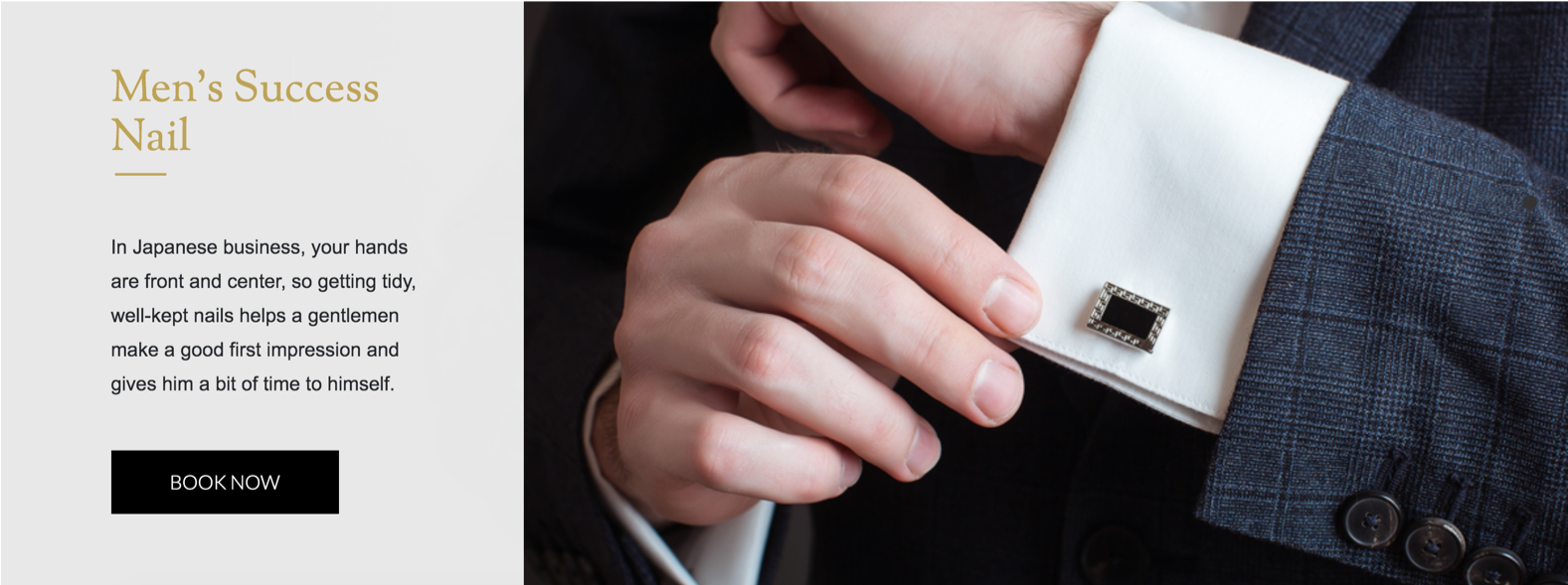
Website page with an image of manicured male hands touching a suit's dress shirt that has cufflinks.
Men's Success line webpage. Credit: Brynna Robin

How we want to make people feel:

"Luxury brands have long known this. In their advertisements, they generate desire by relying on three principles: enrichment, distancing, and abstraction...Desire is created when something is just out of reach."

Website: Luxury • Informed • Secure • Confident in finding the salon • Satisfied • Authenticity • Desire • Extraordinary • Fantasy • Lifestyle Statement

Salon: Luxury • Confidence • Exclusivity • Sense of Status • Value • Serenity • Comfort
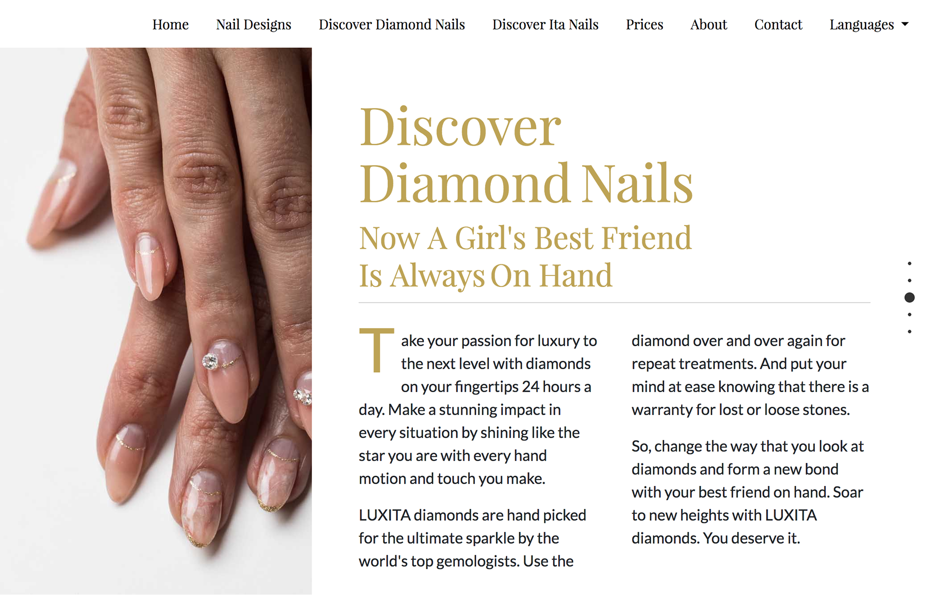
An iteration of a luxury website design. UI design by Katherine Delorme.
iteration of luxury website. UI design by Katherine Delorme.
Experimenting with the copy to hightlight the luxury brand through enrichment via storytelling. Credit: Katherine Delorme

— Design

Design & Test: Grey Boxing, Sketches, Wireframes, and High Fidelity Wireframe

Home Page - Grey Boxing

grey boxing. UI & UX design by Katherine Delorme.

Home Page - Wireframe

mockup/wireframe. UI & UX design by Katherine Delorme.

Home Page - High Fidelity Wireframe
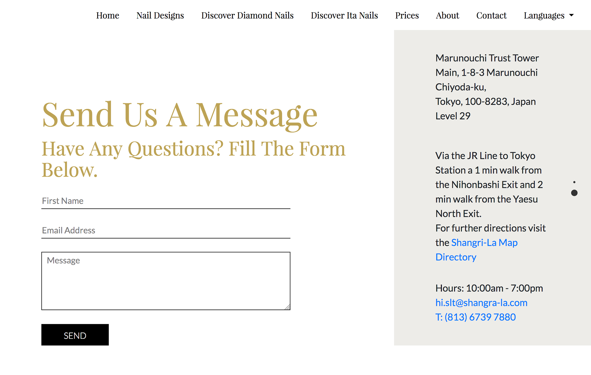
High Fidelity Wireframe. UI & UX design by Katherine Delorme.
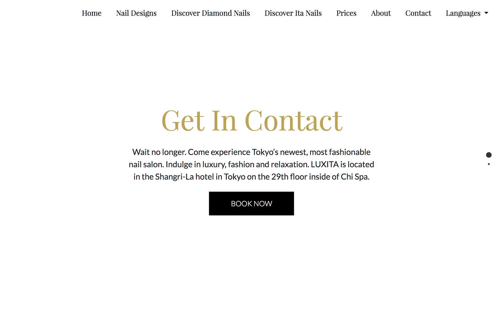
Iteration of luxury website contact page. UI design by Katherine Delorme.
Contact page. Credit: Katherine Delorme
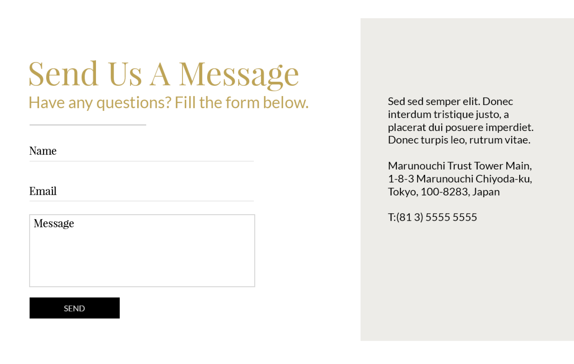
Iteration of luxury website contact page contact form. UI design by Katherine Delorme.
Contact form. Credit: Katherine Delorme
An iteration of the contact form for Japanese luxury nail salon written in English.
Styling the contact form. Credit: Katherine Delorme
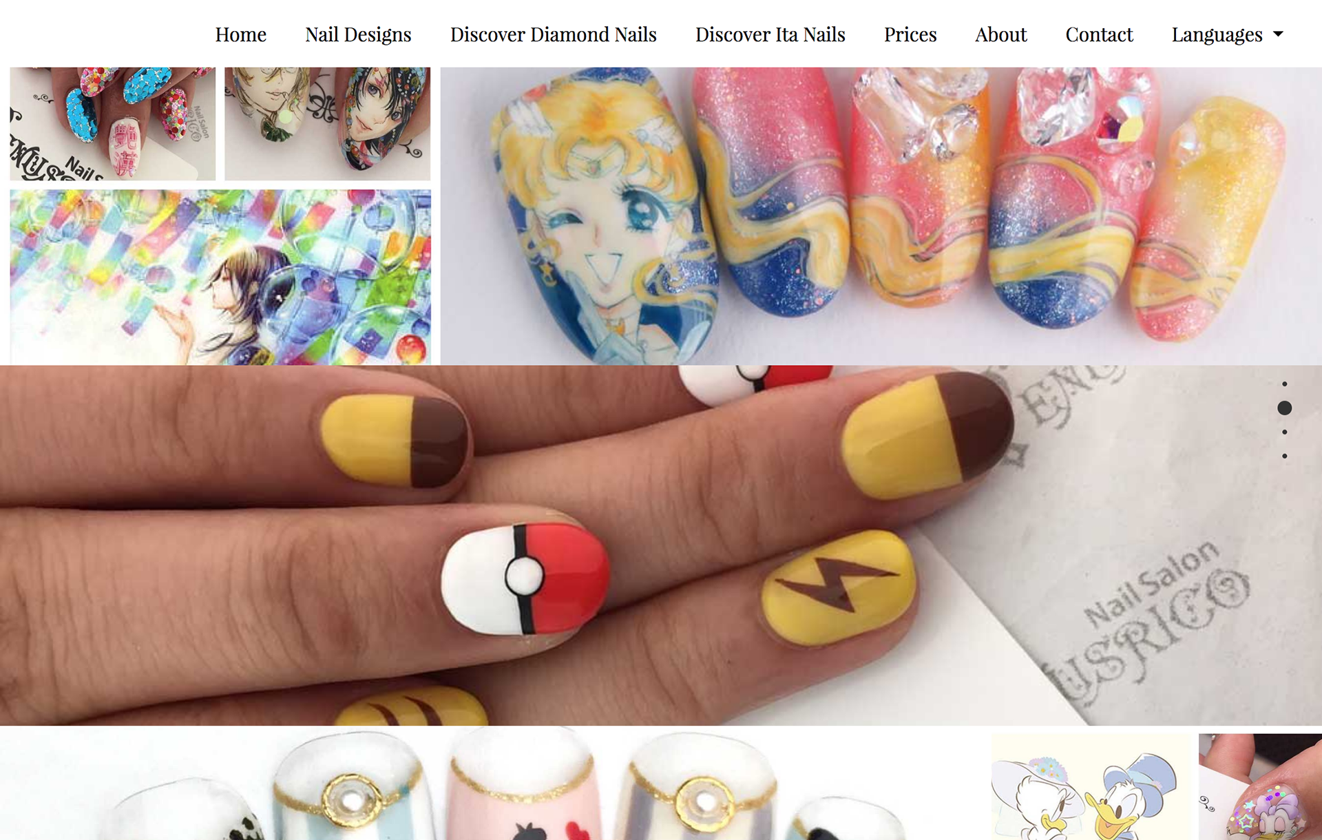
Website nail gallery of designs of Pokemon, Sailer Moon, Disney, etc. UI design by Katherine Delorme
Ita nails. Nail gallery. Credit: Katherine Delorme
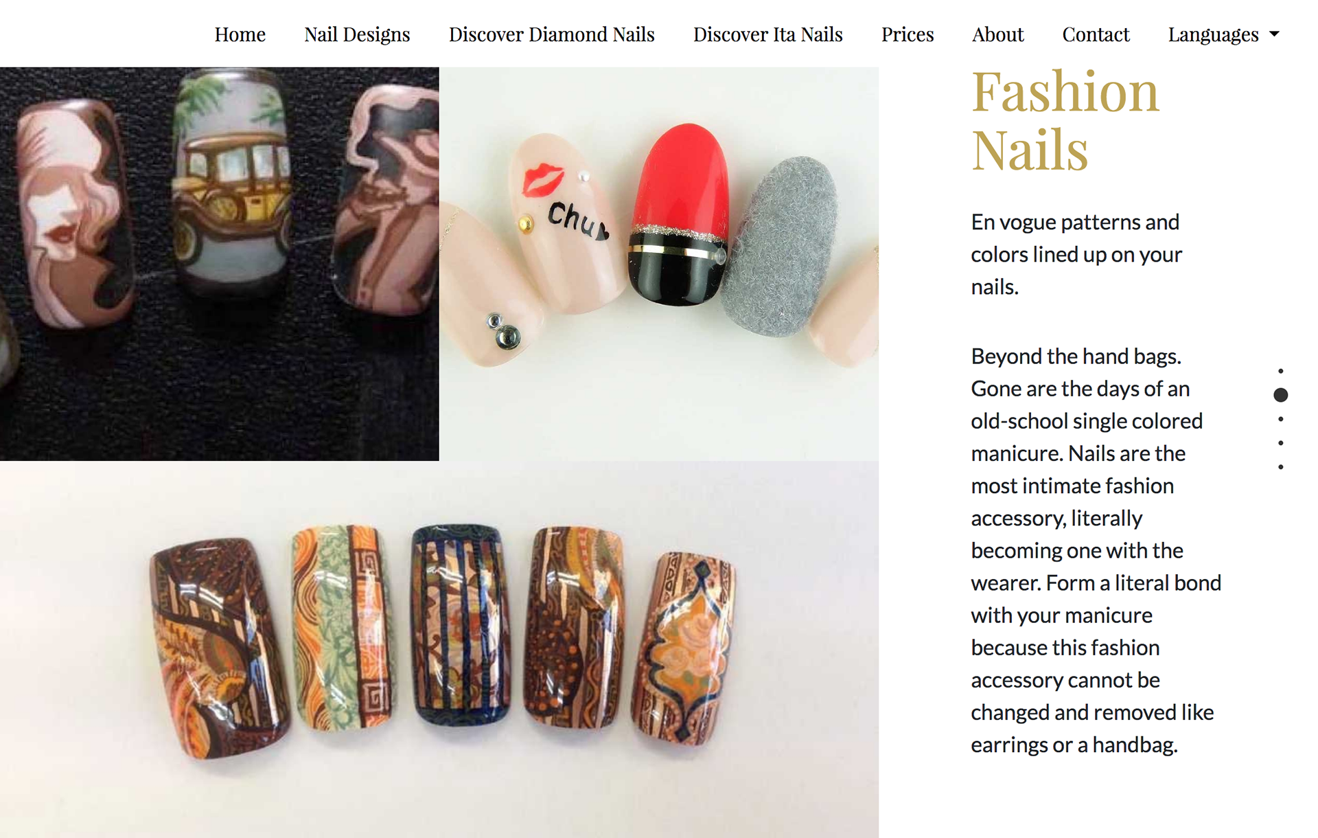
The Fashion Nail page with chic art designs.
Fashion nails. Credit: Katherine Delorme
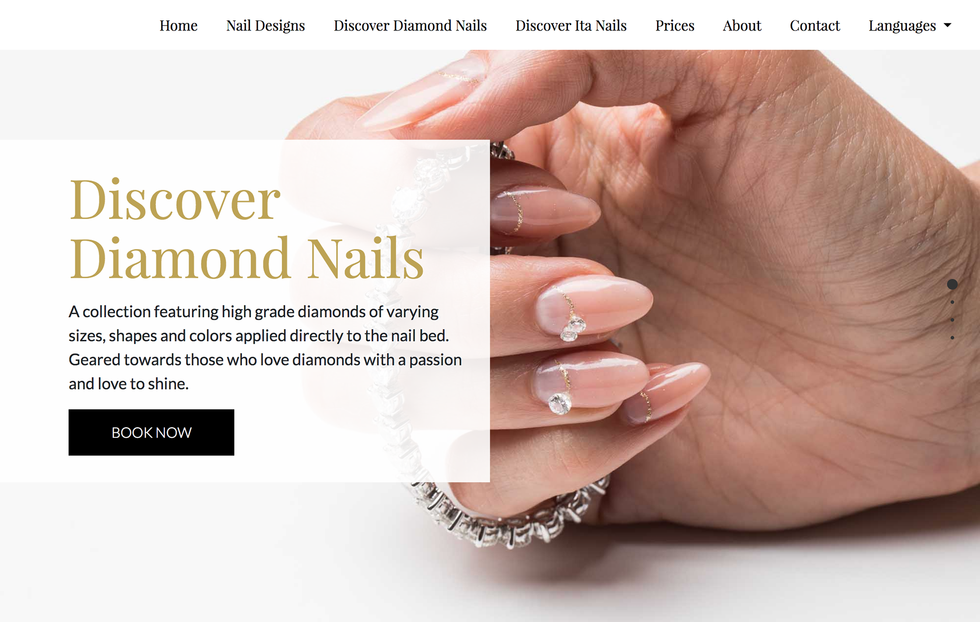
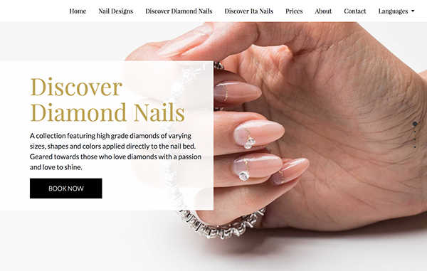
Iteration of luxury website Diamond nail collection. UI design by Katherine Delorme.
Text overlay on images. Credit: Katherine Delorme
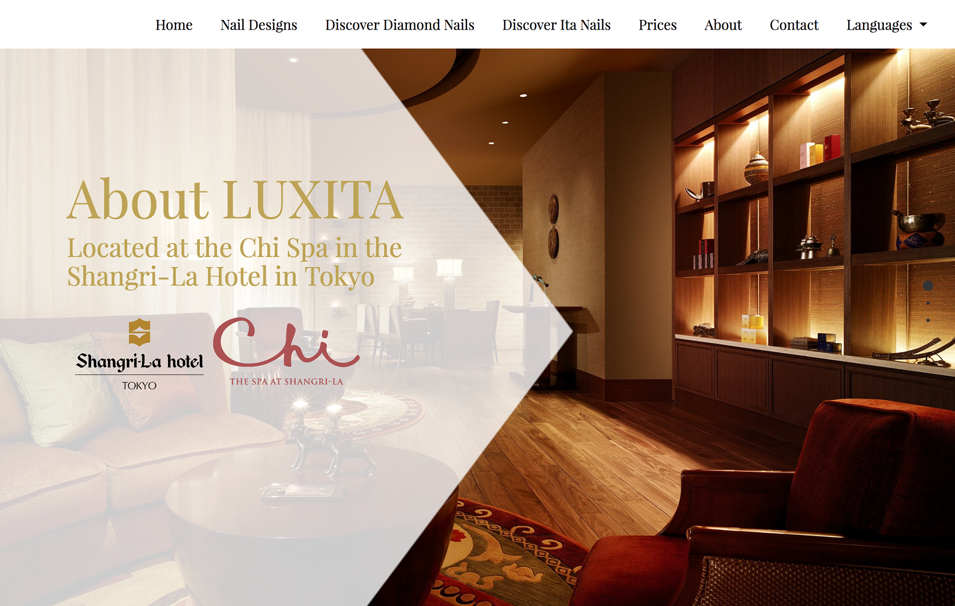
iteration of luxury website Chi Spa location with photo of the spa. UI design by Katherine Delorme.
Playing with shapes. Credit: Katherine Delorme
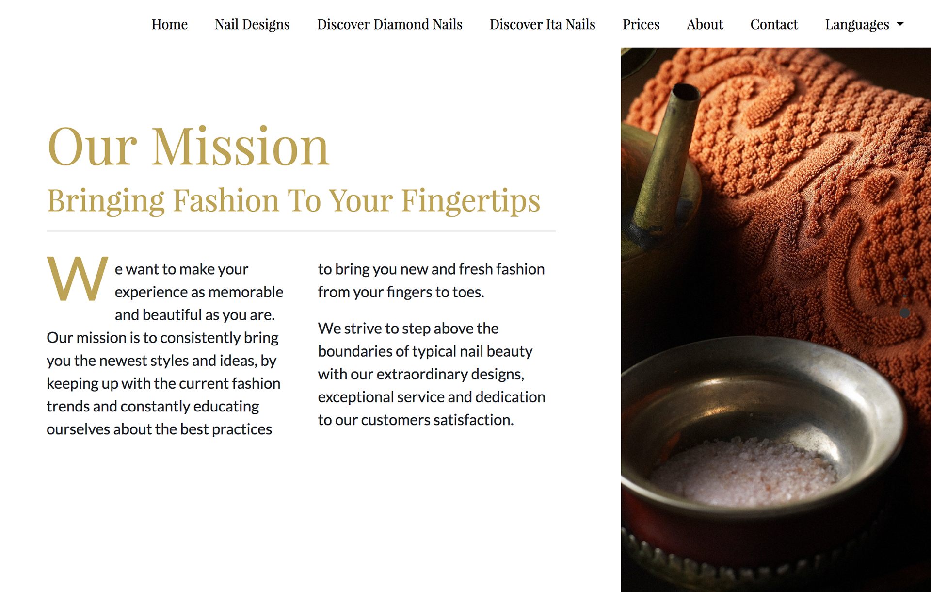
Iteration of luxury website. The mission statement. UI design by Katherine Delorme.
About page mission. Credit: Katherine Delorme
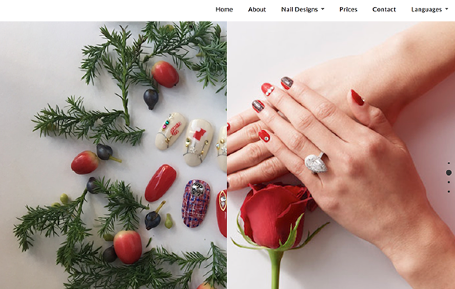
Website section with two photos of winter holiday collection.
Seasonal nails. Credit: Katherine Delorme

— Next Step

Business Research: Market Expansion

After the launch of the English and Japanese versions, the next logical move would be to create a Chinese version. A large percentage of Japan's tourism comes from China. This information backed with the new wealth and middle-class families of China taking part in travel made for a sensible strategy.

Home page language picker. Choices English, Japanese & Chinese. 言語を選択してください。Please Choose A Language
The language selection featuring Japanese, English, and the newly discovered market Chinese. Credit: Katherine Delorme & Brynna Robin

For More Information Read the Extensive Research

Thank you for your time.