"[As UX designers we] understand how to methodically and meticulously plan a UX campaign. And that's what getting a job actually is, maybe we just don't realize it at first. So, we need to UX ourselves, we need to UX our resume, our [port]folio, our process, our interviews, everything." [1]
- Andrew Doherty former Google UX Designer
 Credit: ManyPixels
Personnel 1
Name: Diane K. • Preferred Name: Coworkers nicknamed "D".
Title: Office Manager, Controller (travel accounting)
Role: Accounting, travel, office management, and a kind of Human Resource
Tasks: Payroll, bill payments, software billing, maintenance bills, and ordering conference booths.
Working hours: Monday to Friday 7 am - 3 pm. Being a mother of 2, she needed a schedule that allowed her to drop off and pick up her children.
Years with the company: She started in 2011 and celebrated her 9th year. She has seen the company grow from having 40 customers to the industry player it has now become.
 Credit: ManyPixels
Personnel 2
Name: Erin B. • Preferred Name: N/A
Title: Sales & Marketing Director (subcontractor)
Role: The founder's psychiatrist, the founder's sounding board, and helping with strategy.
Tasks: Marketing and Global Sales.
Working hours: Monday, Wednesday, and Friday. Please note she works in the European timezone.
Years with the company: She started in January 2017 and has been with the company for three years.
 Credit: ManyPixels
Personnel 3
Name: Heather C. • Preferred Name: N/A
Title: Marketing Coordinator (subcontractor)
Role: Implementation of marketing tasks as well as content creation, including the monthly social media content calendar.
Working hours: Monday to Friday. 8:30am - 6pm GMT+1.
Years with the company: She has worked for the company for roughly one year and a half.
Don’t guide
"The way you ask questions is very important, you will have ideas on some parts of the experience and consciously or subconsciously you may start to guide the user in a certain direction." [2]
Get personal
"You need to find out about them, ask about their home situation, job, family life, favorite holiday destination, and hobbies. You need to get a good picture of who they are and what their environment is like." [2]
Feedback
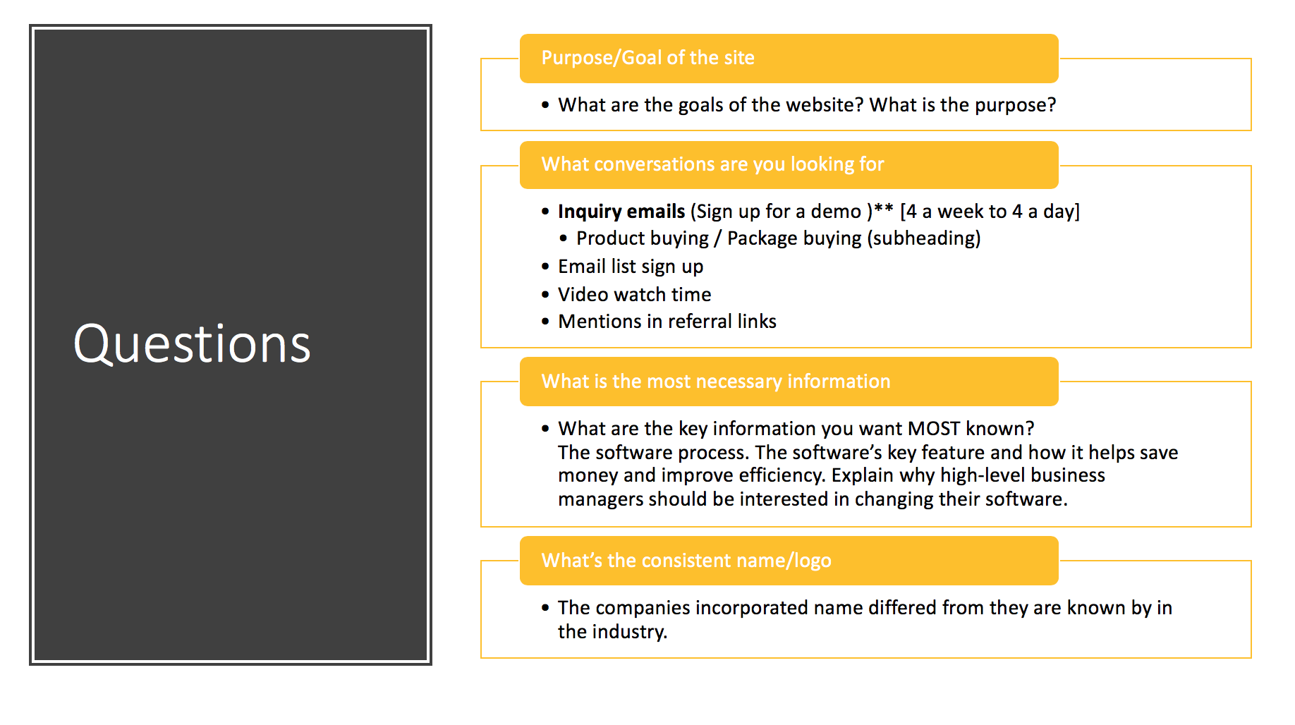
The website has so much text it is an overload of information. Thankfully the information on the website is correct though the messaging is described as "off". The success of conversation stats depends on which team member is asked. Metrics in question include newsletter subscription, calls received by the sales team, downloads of trial versions of the software, and other conversion statistics. The website should encourage visitors to call the company. A sales team member stated there's an increase in sales rate when potential clientele talk with a person. There's also a need for more sign-ups for demonstrations.
There is a drastic difference between the founder's belief regarding the website's purpose and the marketing team. The key company value most iterated by the employees was "community". There seems to be a unison desire for the company to be seen as a pinnacle member of the road servicing community. A resource to turn to for valuable information and open discussion. Some users when faced with difficulties using the software blame the tool to spare their ego, in contrast, to calling tech support, watching the online tutorial, or attending a supplementary class.
The company's image is VERY American, which has hindered its expansion into the international market. The company needs to have more of a global feel to appeal to international clients. Ideas to appear more international include using diverse photos. The current site only displays American roads that are larger than most European roads. The website should also use more neutral language downplaying the American accent.
Color: Brand Useage and Identification
Color Problem
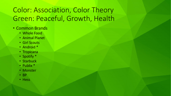
The website I was tasked with made use of the brand's identifying color of green, but it was in such an overbearing way it aged the site. The site heavily used dark green alongside black, and a blue that defaulted from the backend framework. Green is a challenging color to work with, but many brands have utilized it well.
 List of brands whose identifying color is green Credit: Katherine Delorme
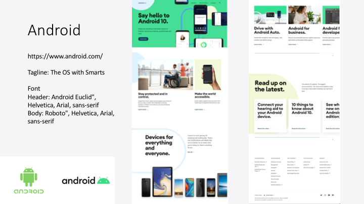
 Android evaluation Credit: Katherine Delorme
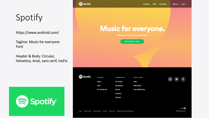
 Spotify evaluation Credit: Katherine Delorme
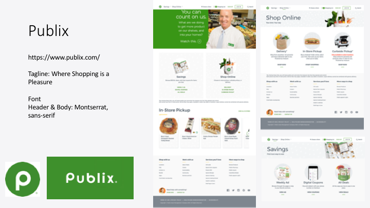
 Publix evaluation Credit: Katherine Delorme
Color Conclusion
"Green Should Be Used As An Accent Color."
After reviewing the websites, apps, and other marketing materials of brands known for the color green, I concluded that green's greatest strength is when it's an accent color. It's present in the logo, but as far as the website greens are toned-down in favor of content, scannability, and readability.
Color Mood Board
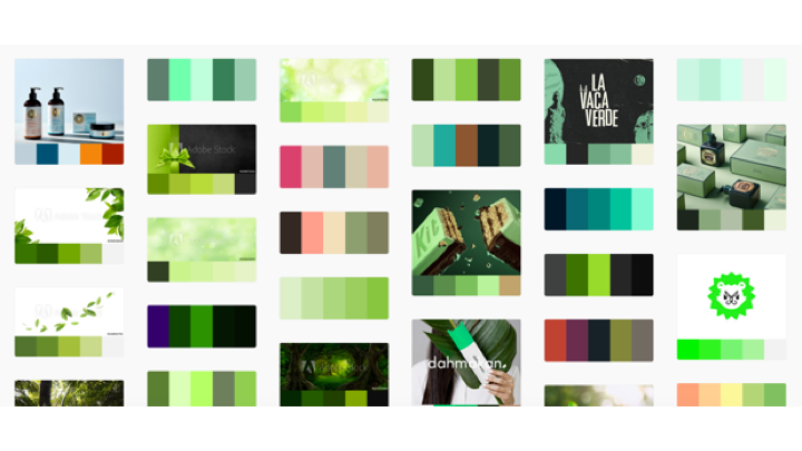
I wanted the client to understand the impact of using green as an identifying color as well as show how the color could be paired with other colors.
 Color Mood Board via Adobe Color Credit: Katherine Delorme
