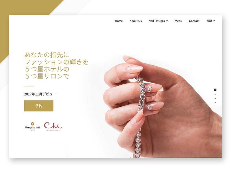
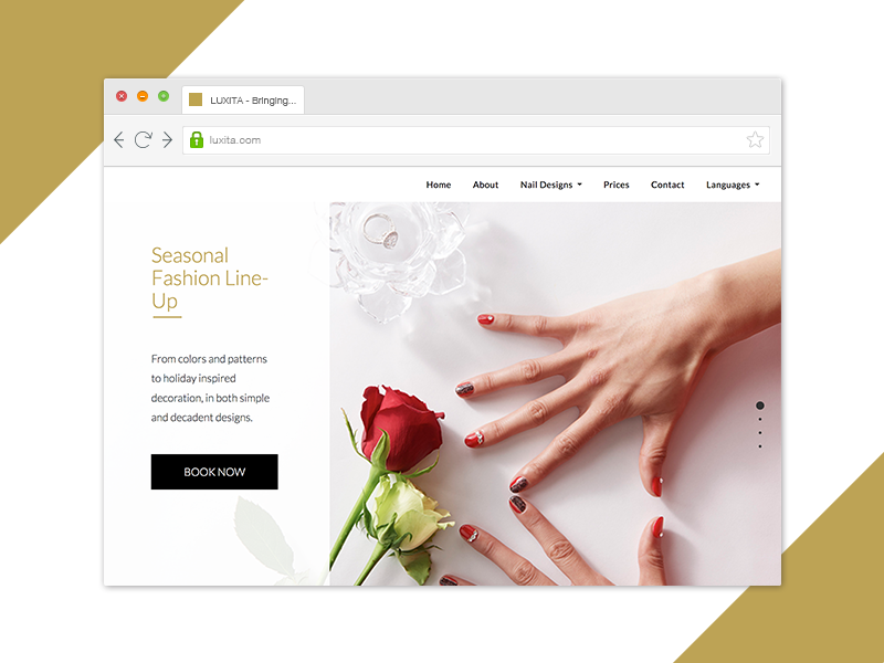
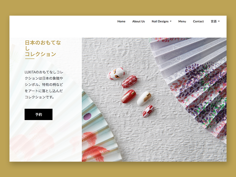
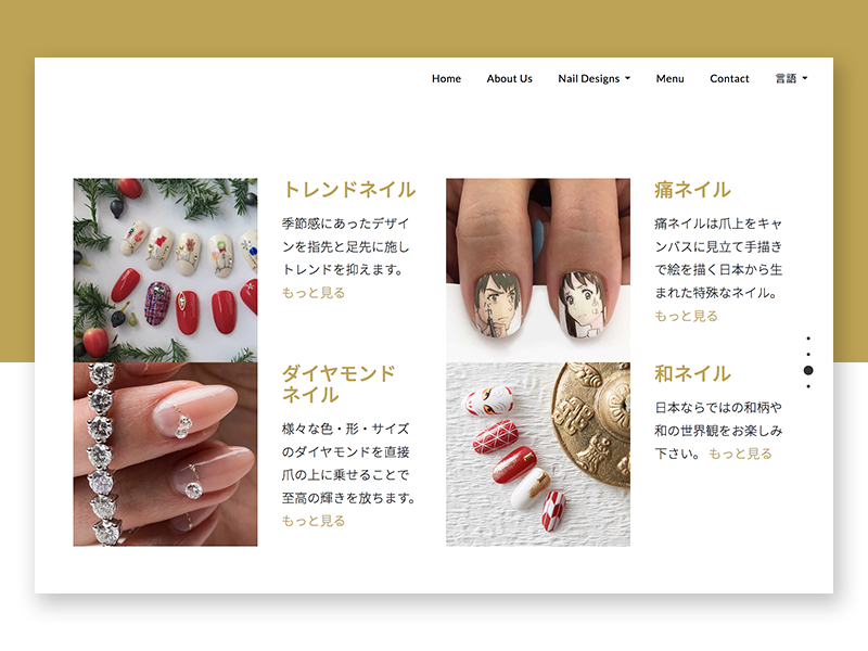
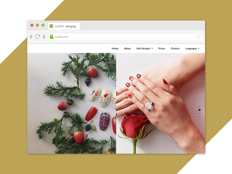
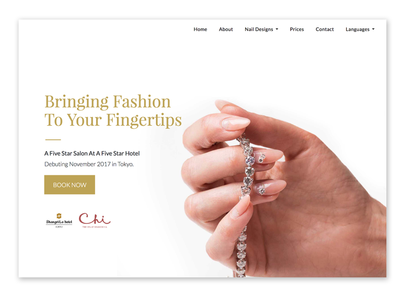
J-Cast JoliArts were opening their fourth nail salon in Tokyo and first in the Shangri-La Tokyo Hotel. For this reason, I created a website for the brand in time for the launch.
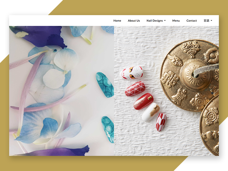
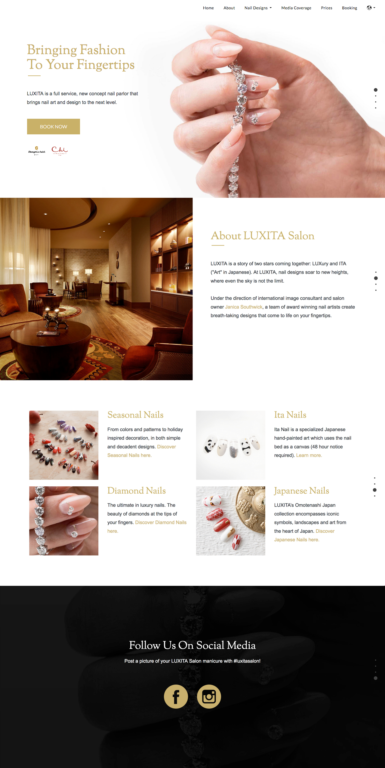
View WebsiteI was brought in from America to Japan to brand the LUXITA online presence and launch a multi-lingual website.
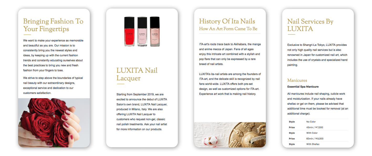
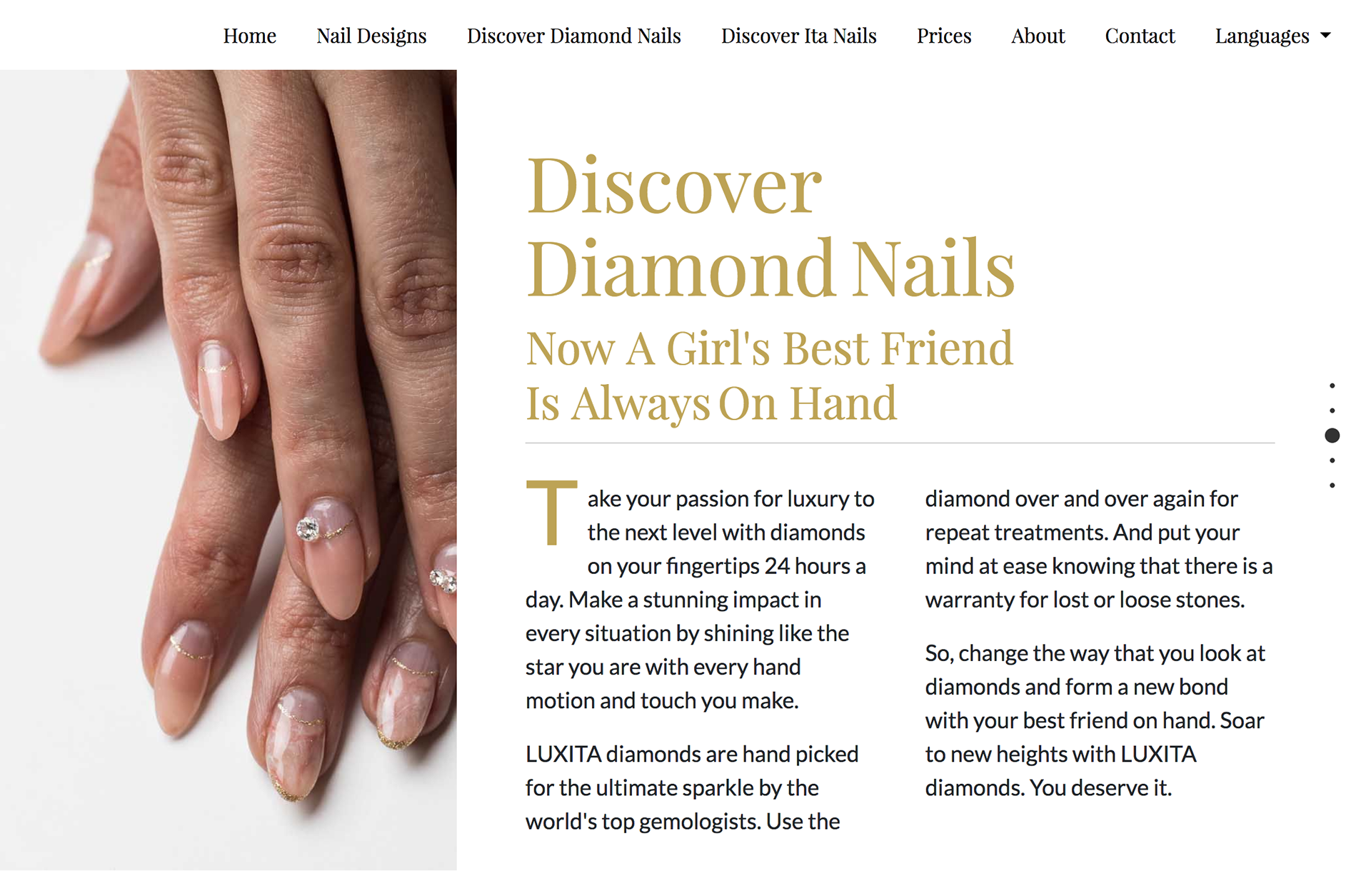
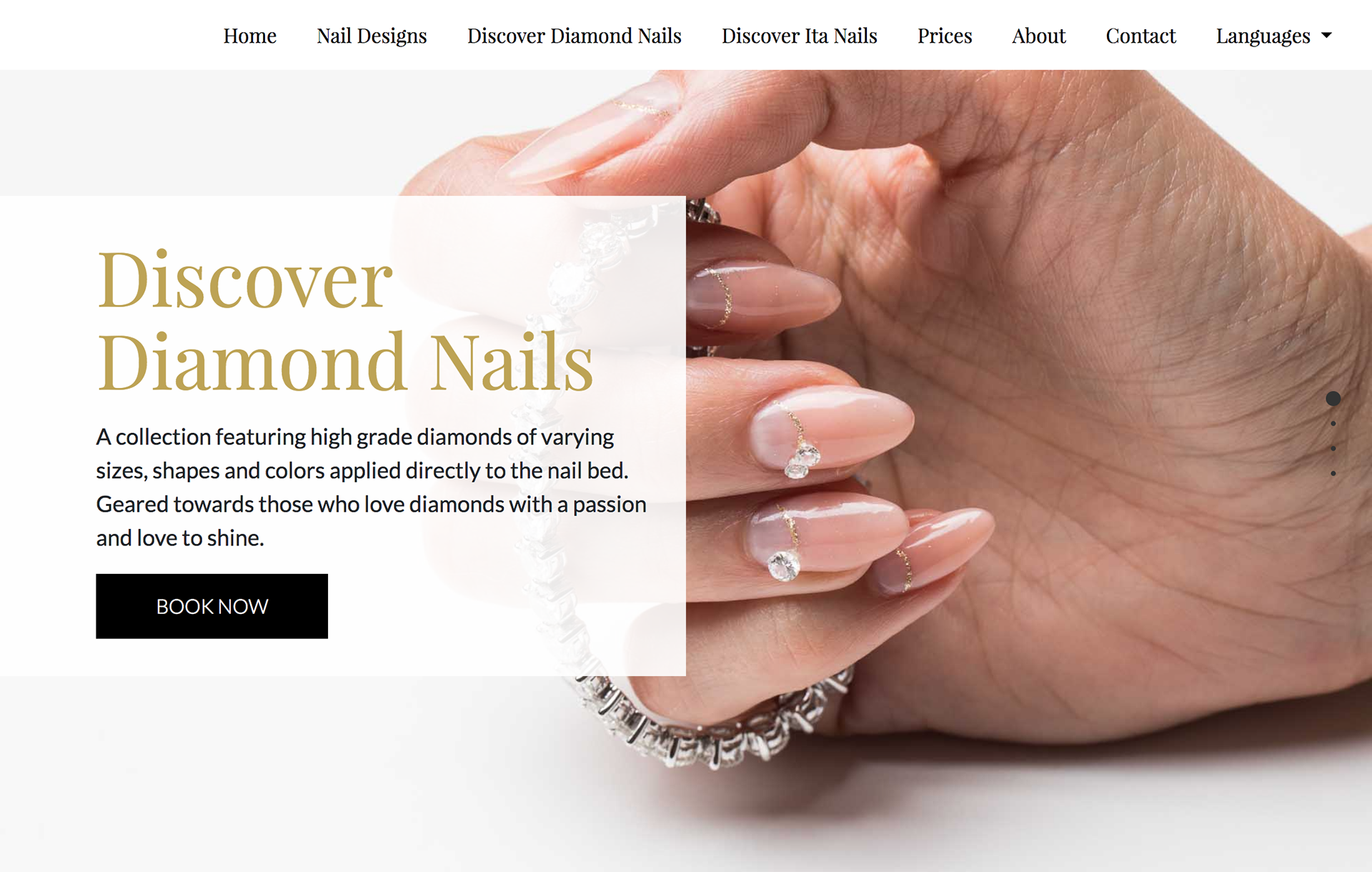
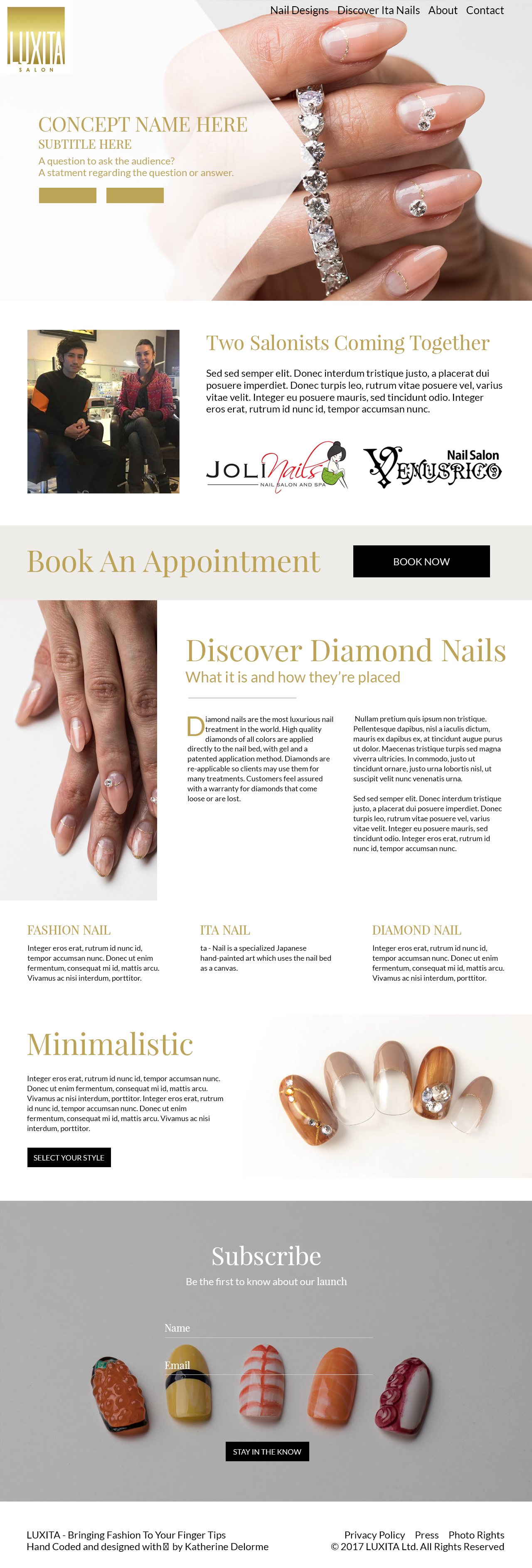
With separate sub-domains for each language, the decision was made to go towards a more western aesthetics. The idea stemmed from the owner's desire to avoid having a cluttered site commonly seen on Asian websites. I set to design something minimalistic while incorporating flat design.
The distinctive difference between this salon and the previous was that it was set to be branded as a luxury brand. It needed to appeal to both foreign tourists and Japanese natives.
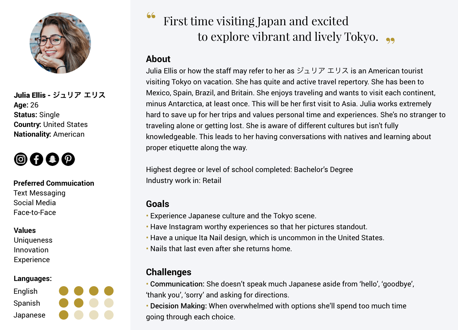
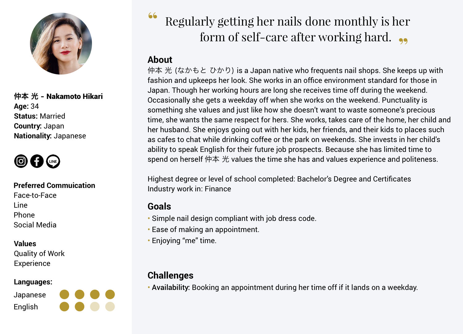
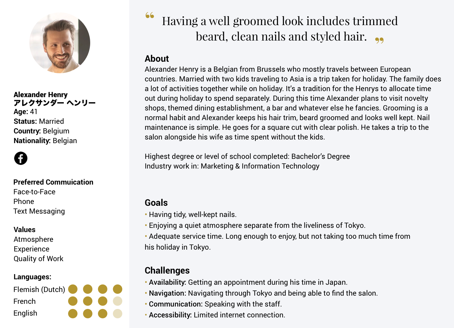
International tourists with no to limited Japanese language skills aiming to visit the nail salon need a quick, convenient solution for booking appointments, and locating the salon. Luxury brand enthusiasts seeking an experience, need easy to see nail options. Both Western and Eastern users should be able to navigate the website easily.
Create a luxury brand website appealing to both foreign tourists and Japanese natives. While designing, avoid creating a cluttered site that is commonly seen on Japanese websites.
The challenge of designing UX and UI in Japan
By. Ticketbis UX June 7, 2016
"Japan is well known by its sense of aesthetics, which we usually relate to minimalism, and simplicity. When we (westerners) think about Japanese design usually something clean and haiku style comes to our minds."
"So, how come their web designs are anything but welcoming, unwordly, calm, austere or simple? Browsing almost any Japanese web page, one can quickly realize that none of these principles [Wabi-Sabi] are followed. Quite the contrary, it seems as if the opposite rules were applied. If you visit the most popular websites in Japan you’ll often find a mix of bright color, excessive use of text and no navigation orientation. There is so much visual noise, that you can feel like you’re walking through the chaos of Shibuya streets in Tokyo."
"You also need to keep in mind that certain colours have different meanings in different cultures. For instance, in westerner cultures, red is the color of love and excitement and can be associated with both negative and positive purposes. But in Japan it means happiness and joy."
"When designing for westerner web sites, one can play with typography to create rhythm and style. But when you have to deal with Japanese writing that’s a different story, since there are only a few available web fonts...Japanese fonts need to include the katakana and hiragana alphabets and a pile of kanji...making their web fonts just too heavy to load on a webpage."
I created personas based on the owner's previous salon's clientele for comparison. As well as personas for what would be the new salon's prospect clientele. Additional data given about the hotel's typical guests and usual foot traffic was also used. The addition of the hotel's insight widened my perspective from two personas to three: Japanese resident, an American tourist, and a European tourist. The additional details regarding the persona's lifestyle and habits came about from research findings.
The personas created helped prove the necessity for the website to be accessible on mobile devices as well as load quickly. International tourists are more likely to discover the salon on their mobile devices. Discovery, in addition to using the website's directions to navigate to the salon while in transit, made page load speed a priority. Japanese cell phone culture is tied closely with the transportation culture. The majority of Japan's commute takes place on trains. The idle time commuting on trains creates an increase in the usage of mobile devices.
Though this did not directly affect the website's planning phrase, it helps bring awareness for the company owner in regards to the physical store. Japan is a cash-based society.[16] Though most tourist traveling to Japan are made aware of this fact, not every person living outside of Japan are aware. Those living in countries like the United States are accustomed to card payments and money transfer apps like Apple Pay, Google Pay, Samsung Pay, Square, and more.
Website: Luxury • Informed • Secure • Confident in finding the salon • Satisfied • Authenticity • Desire • Extraordinary • Fantasy • Lifestyle Statement
Salon: Luxury • Confidence • Exclusivity • Sense of Status • Value • Serenity • Comfort
"Luxury brands have long known this. In their advertisements, they generate desire by relying on three principles: enrichment, distancing, and abstraction. The differences from mass-market and premium brands are striking. Through enrichment, such as storytelling, luxury brands take us on a journey towards the destination of desire. We rarely desire what we can have immediately. That’s why we seldom desire the ordinary world. Desire is created when something is just out of reach." [14]
Home Page - Grey Boxing
Home Page - Wireframe
Home Page - High Fidelity Wireframe
Home Page - Grey Boxing
Home Page - Wireframe
Home Page - High Fidelity Wireframe
After the launch of the English and Japanese versions, the next logical move would be to create a Chinese version. A large percentage of Japan's tourism comes from China. This information backed with the new wealth and middle-class families of China taking part in travel made for a sensible strategy.[1][2]
"Government officials estimate that 31.2 million foreign nationals visited Japan in 2018. The figure rose 8.7 percent from a year earlier, marking a record high for the 6th straight year. Visitors from China accounted for 8.38 million, up 13.9 percent. Chinese tourists accounted for nearly 34 percent of all spending, at over 14 billion dollars." -NHK
After completing this project, I gained an interest in working on more Japanese websites. Doing so would allow me to explore user experience and interface design further for the Japanese market. I feel the same about exploring other Asian countries like China, Korea, and India. My curiosity also extends to the user experience of those across the pond in Europe.
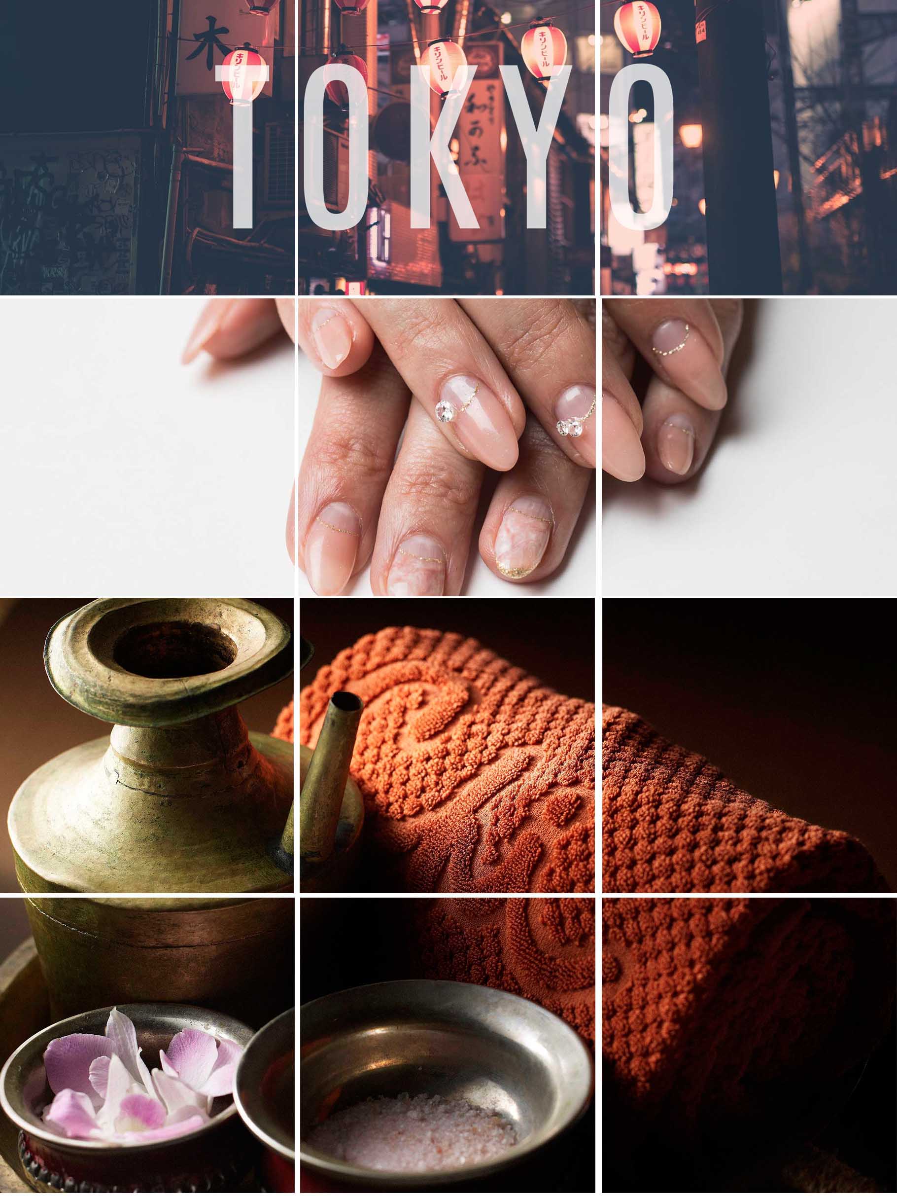
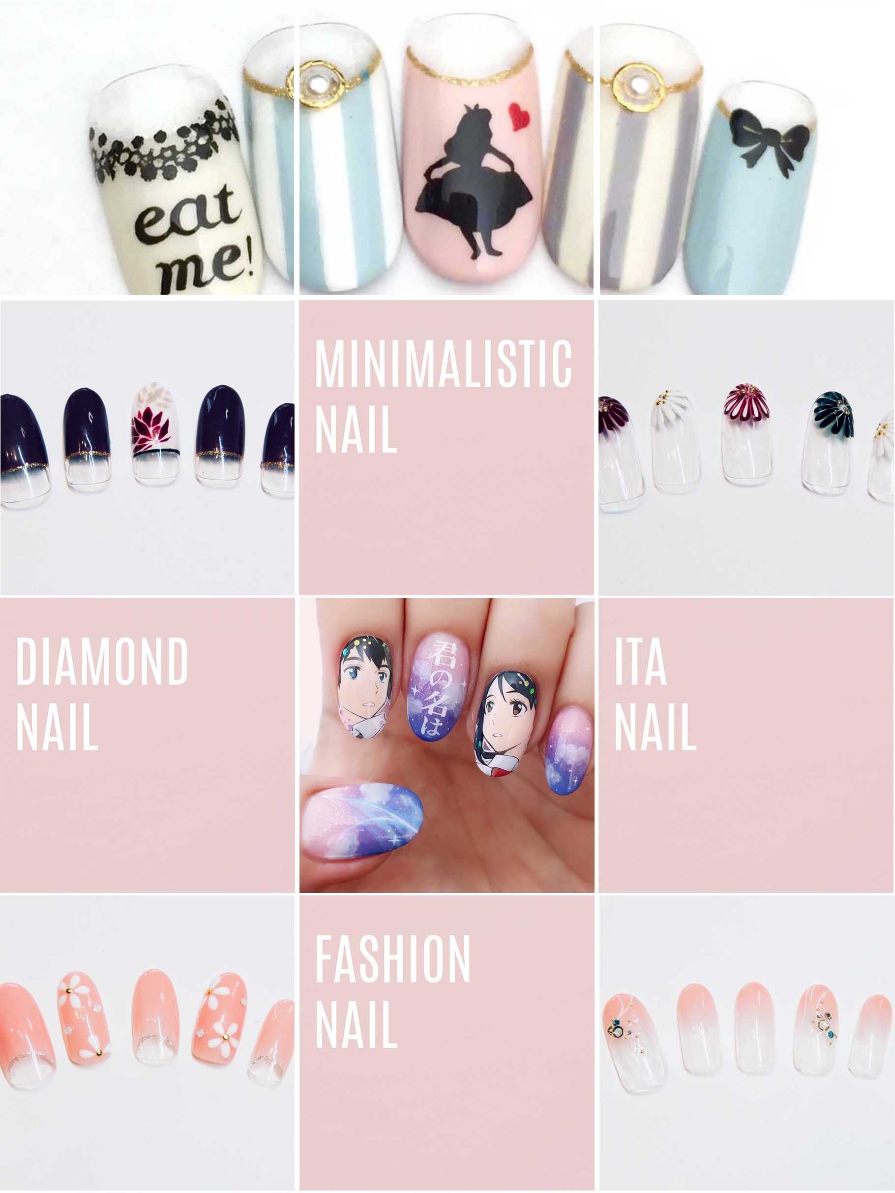
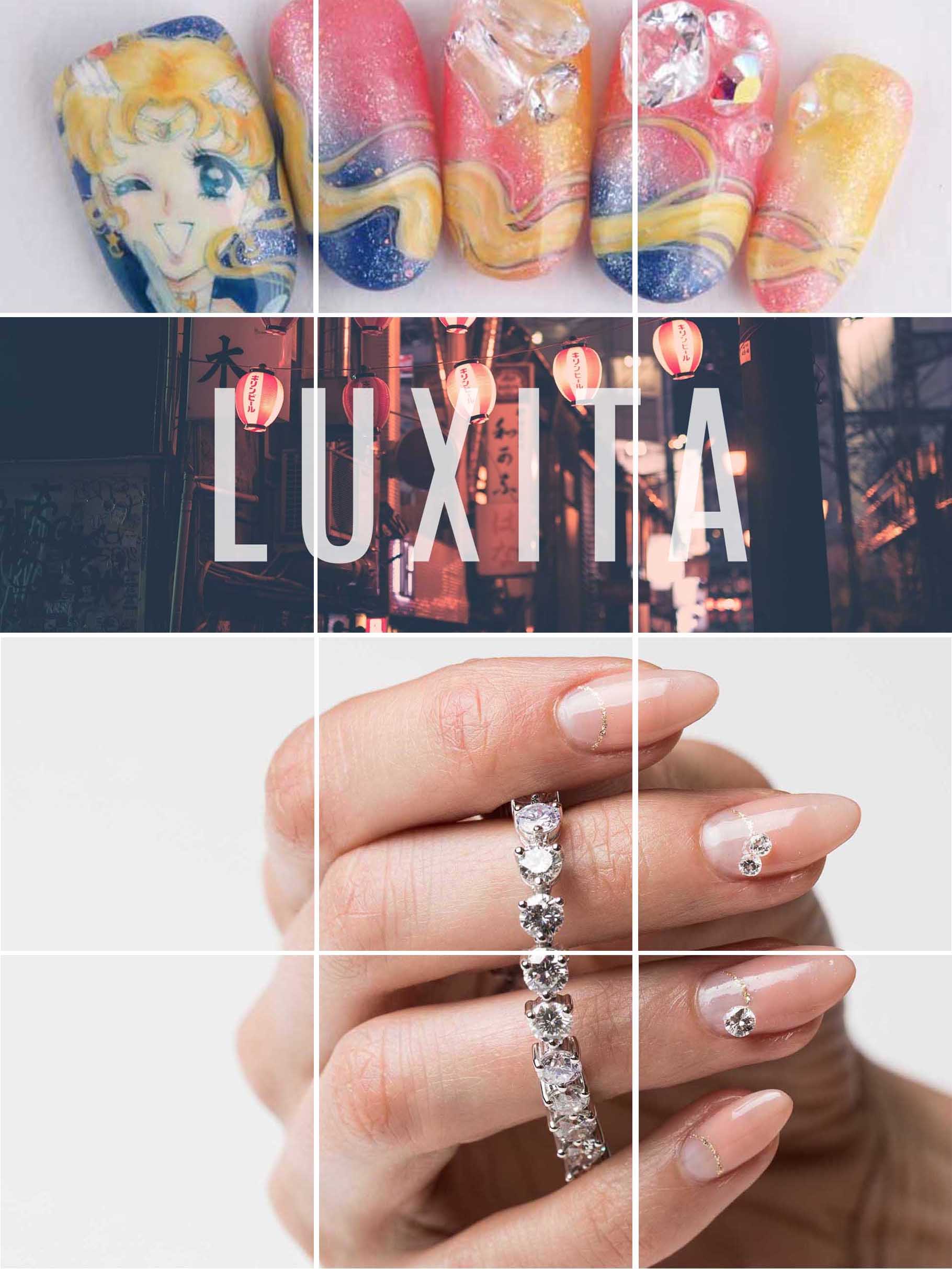
The next course of action could include starting a social media strategy. I played around with ideas for a possible Instagram grid. Comparing the most popular social media platforms, Instagram would be the most efficient platform in reaching an audience and the salon's clientele. In my first iteration, I made the mistake of forgetting to capture a luxury brand atmosphere. What I created matched more of Instagram's aesthetics at the time. If I have time, I'd like to revisit this and create a grid that captures the luxury brand's storytelling, status, exclusivity, uniqueness, and lifestyle.